Firefox user notice:
Please use another web browser to view this document.
Sorry for the inconvenience.

Buildify for Magento 2 is one of the very few WYSIWYG solutions for building content for online stores powered by Magento 2 Open Source. Employ Buildify page builder to create and arrange content for pages, blocks, category and product descriptions. Start a layout, select widgets from the extensive list of thereof, collate them within the working area and customize neatly to have your content attractive and engaging on all kinds of devices.
Compatibility: Magento Open Source 2.3.X - 2.4.X
Thank you for choosing Aheadworks!
Installing Magento 2 Buildify
| Command Line Installation | Composer Installation |
|---|---|
1. Backup your web directory and store database 2. Download the Buildify installation package 3. Upload contents of the Buildify installation package to your store root directory 4. In SSH console of your server navigate to your store root folder: cd path_to_the_store_root_folder run: php -f bin/magento module:enable Aheadworks_Buildify then: php -f bin/magento setup:upgrade after: php -f bin/magento setup:static-content:deploy 5. Flush store cache; log out from the backend and log in again Make sure the installation is done from the FTP administrator account. Otherwise, set 775 permissions to the store root directory after the extension is deployed. | If you are installing an extension from Aheadworks for the first time, you need to add our composer repository to your Magento store: 1. Login to your ssh console and navigate to your store folder:
cd path_to_the_store_root_folder
Run the following command:
composer config repositories.aheadworks composer https://dist.aheadworks.com/
On successful execution of the commands you will be able to use the composer to install the extensions. To install the extension: 2. Login to your ssh console and navigate to your store folder:
cd path_to_the_store_root_folder
3. Run the following command to install the latest version of the extension: composer require aheadworks/module-buildify
if you need to install a specific version, run this command: composer require aheadworks/module-buildify:<version>
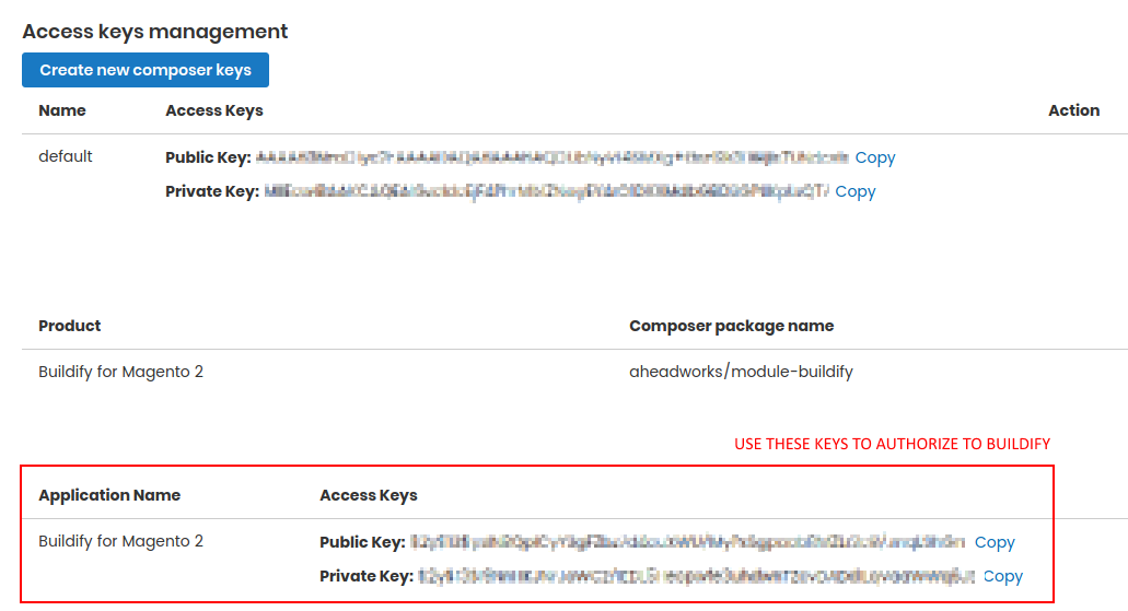
Specify the version of the extension in <version> When prompted, enter Composer Public Key (Username) and Private Key (Password): Both Composer Public Key (Username) and Private Key (Password) can be found in My Projects and Licenses in your personal account on our site:
4. Enable the extension: php -f bin/magento module:enable Aheadworks_Buildify
Next, register the extension: bin/magento setup:upgrade
Recompile your Magento store if you are in the Production mode: bin/magento setup:di:compile
To verify that the extension is enabled, run this command: bin/magento module:status
Clean store cache, by running the following command: bin/magento cache:clean
Log out and Log in the backend again. To upgrade the extension: 5. To update or upgrade an extension: Download the updated extension file. Take note of the module-name and version. Export the contents to your Magento root. If a composer package exists for the extension, run one of the following. Update per module name: composer update aheadworks/module-buildify Updater per version: composer require aheadworks/module-buildify:<version> Run the following commands to upgrade, deploy, and clean the cache. php bin/magento setup:upgrade --keep-generated
php bin/magento setup:static-content:deploy
php bin/magento cache:clean
|
.png?version=1&modificationDate=1613404181445&cacheVersion=1&api=v2&width=450&height=83)
Introducing Magento 2 Buildify
Buildify page builder for Magento 2 is a WYSIWYG visual editor to create and arrange content for pages, blocks, category and product descriptions. Buildify is widget-based, and comes with an extensive selection of widgets. The solution allows starting a layout of the page, drag and drop widgets onto it, collate them within the working area and customize neatly to have your content attractive and engaging on all kinds of devices. The key-features of the solution are as follows:
- Multiple content widgets to be taken on without any further coding
- Highly customizable style and layout options of the widgets
- Drag & drop action to easily arrange widgets within the content area
- Tweaking content to render well on various devices and screen sizes
- Support of native Magento 2 widgets and image storage
Known Issues
It has been reported, that staging environments which employ NGINX Auth can display page preview incorrectly in Buildify.
Add the code below into the nginx.conf file if either of the following is true for you:
- Header and/or Footer are not displayed in the Preview area of the editor.
- Authentication credentials are prompted when the editor is loaded (on loading the <domain>/aw_buildify/page/preview page)
The file is found in the Magento directory.
location / {
            location ~ ^/aw_buildify {
               auth_basic off;
                try_files $uri $uri/ /index.php$is_args$args;
            }
    }
Alternatively, grant https://magento.buildify.shop/ (ip 157.245.245.206) access to your staging environment.
General Information
Authorizing to Buildify
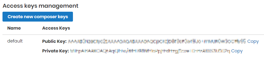
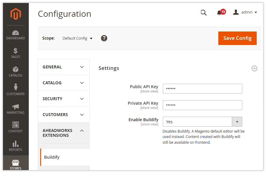
Go to Stores → Configuration → Aheadworks Extensions → Buildify to enter the authorization keys and start working with Buildify. Two keys are required: Public and Private API. Find the keys in My Projects and Licenses in your personal account on aheadworks.com.
Make sure, you use the Buildify authorization keys, not the Composer ones. The latter are used to install extensions from Aheadworks. Buildify authorization keys are located on the My Projects and Licenses page below the list of purchased products, at the bottom of the page.
To enable Buildify, set Enable Buildify to Yes. By default, the selector is set to No. When Buildify is disabled a Magento default editor is used. Content created with Buildify remains available on Front-end on disabling Buildify.
What can I edit with Buildify?
Buildify page builder is available for the following entities of a web-site:
- Pages
- Blocks
- Product descriptions
- Category descriptions
- Blog posts in Aheadworks Blog extension.
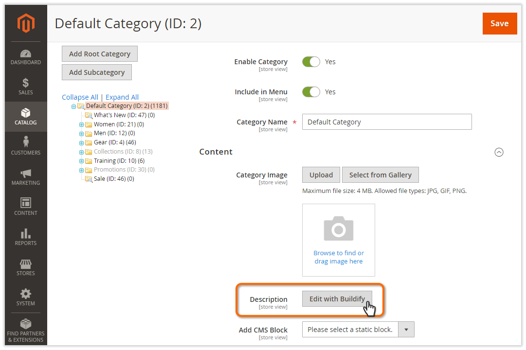
Buildify page builder is embedded into the interface of the Create/Edit Page/Block/Product/Category pages (normally, the into "Content" section thereof). It loads itself automatically on loading of the pages. However, when on a Create/Edit Category/Product page, click on the Edit with Buildify button to load the builder. The button is located next to the Description option in the Content section.
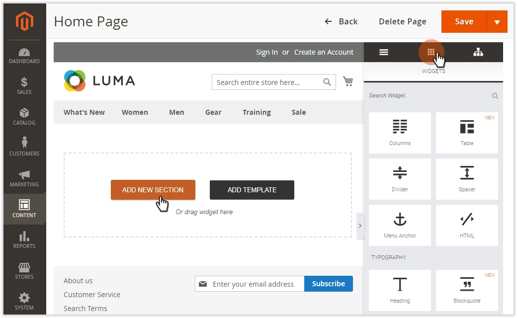
Buildify Interface
The builder has two working areas: Preview and Widgets.
The Preview area displays the whole store page, including the content under construction, web-store header, menu and footer. This is where you can arrange the layout of the page, allocate widgets onto and preview changes to the configuration of the sections, columns and widgets.
The Widgets area comes in three tabs: Menu, Widgets and Elements Tree. The Widget tab lists content widgets classified into named groups. Scroll down the list to pick out a widget, or use the Search Widget field to find one quickly.
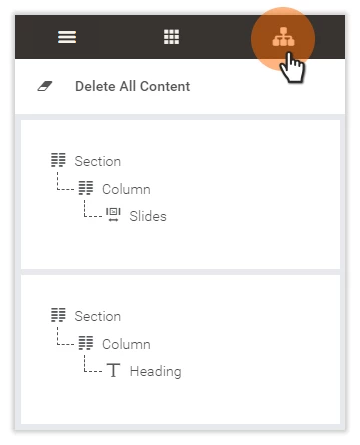
The Elements Tree tab shows the structure of the sections of the content you are designing. It also enables editing the layout of the page or deleting the content from the Preview area.
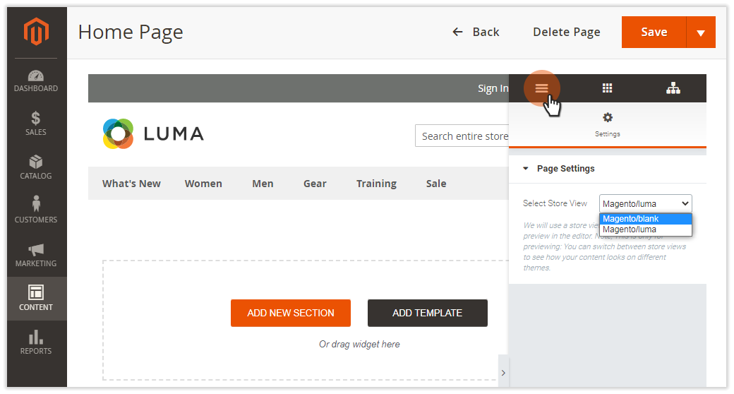
The Menu tab gives access to the settings of the editor. This is where you can select the view for the Preview area.
To change the view, go to Widgets Area → Menu → Settings → Page Settings and select a view with the help of the Select Store View setting. The Preview area will then display the page in compliance with the styles of the chosen theme.
Changing views for the Preview area does not change the theme of the web-site. The features are meant for previewing only: for you to switch between the store views to see how your content looks with different themes.
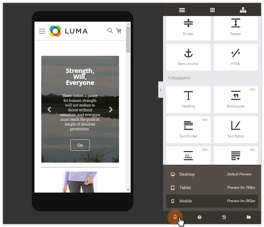
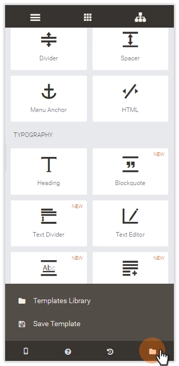
The bottom of the Widget area contains four tabs: Responsive Mode, Help, Revisions and Templates (from left to right). Each tab is supported with an icon, meant to visualize the purpose of the tab.
The Responsive Mode tab allows choice of the preview mode: Desktop (default), Tablet or Mobile. On choice of the mode, the Preview area shows the page and its content the way it will look on the screen of the chosen device. The Tablet and Mobile views show content in device frames.
Use the Responsive Mode to test the responsiveness of the content you have just created.
Help is next to the Responsive Mode tab. Clicking on the Help icon will take you to the present manual.
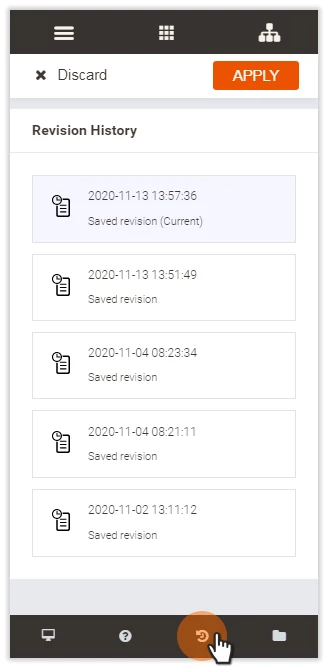
The Revisions tab is next to Help. Clicking on the Revisions tab opens the list of all the revisions (saved versions) of the given content. The versions show the date and time when the revisions were saved. To load the content, select the version and click on Apply above. To cancel selection, click on Discard.
The Templates tab is to the right of the Revisions tab. Clicking on the tab allows choice of saving the present content as a template or loading a template from the Templates Library.
Page Layout
Using Templates
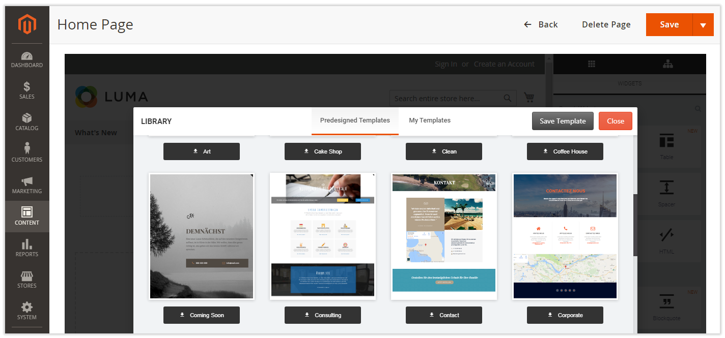
Buildify comes with a number of free pre-made page templates, which you can employ with the help of the Add Template button in the Preview Area. Clicking on the Add Template button opens the Templates Library popup holding a selection of templates. Templates are shown as thumbnail images. There is an upload button below each image telling the name of the template. Use the button to employ the template to your layout. When loaded, you will be able to modify the template, if need be.
The Templates Library popup has two tabs: Predesigned Templates (on display by default) and My Templates. Content designs that you save appear on the My Templates tab. To save a template, click on the Save Template button next to Close in the right top of the popup and confirm the action.
To use big templates from Predesigned Templates, increase the max_input_vars value in php.ini
Arranging Layout Manually
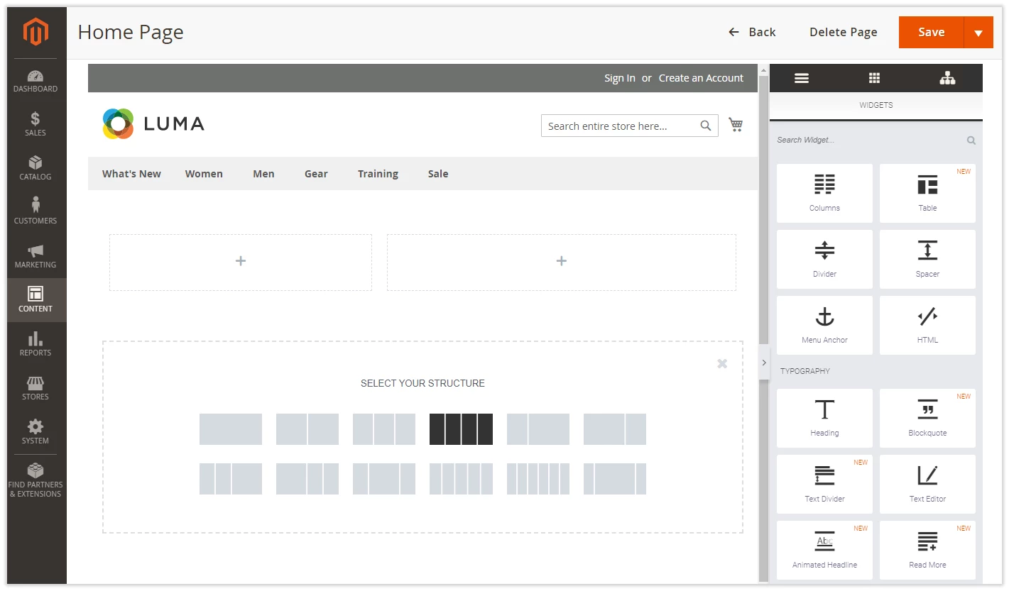
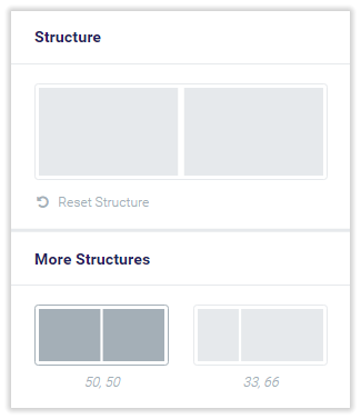
Start with the layout of the content first. Click on the Add New Section button in the Preview area to see some pre-arranged content structures. The selection appears in the Select Your Structure area which substitutes the buttons Add New Sections and Add Template. Click on the structure and it will be added to the page right above the Select Your Structure area. You can add as many structures of layout as you need.
A structure here is a row of columns within a section.
The Columns widget can also be used to arrange the layout of the page.
The layout of the page can be rearranged at any time:
- columns can be added to or deleted from the sections
- sections can be swapped
- the order of the columns can be altered
- columns can be swapped between the sections
- the configuration of the columns/sections can be tweaked
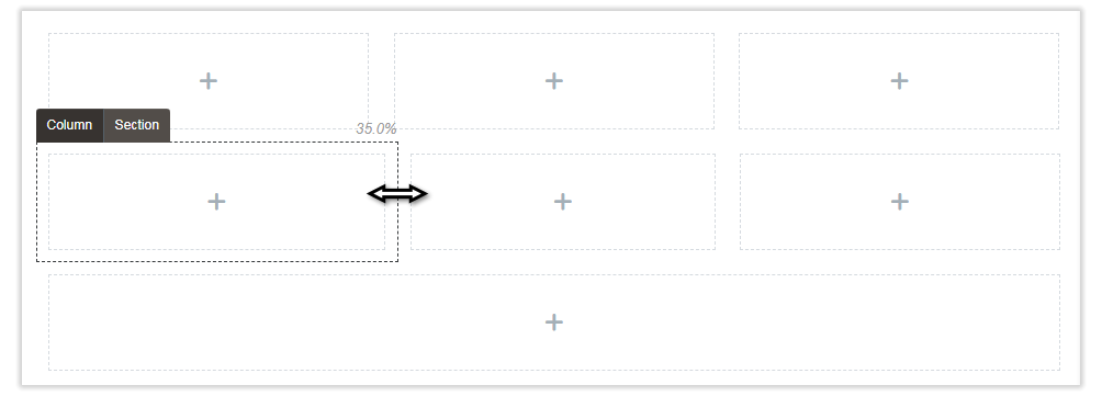
To change the width of the column, hover the cursor over the right border of the column until the Resize pointer appears and drag the border to the right/left. The % value at the top of the column will indicate the part of the section the column takes.
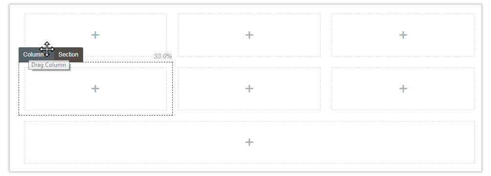
To change the position of the column/section, hover the cursor over the Column/Section tab at the top left of the column/section until the Reposition pointer appears and drag and drop the column/section to the new position. This is how you can change the order of the sections within the layout, the order of the columns within the section, and to relocate the columns from one section to the other.
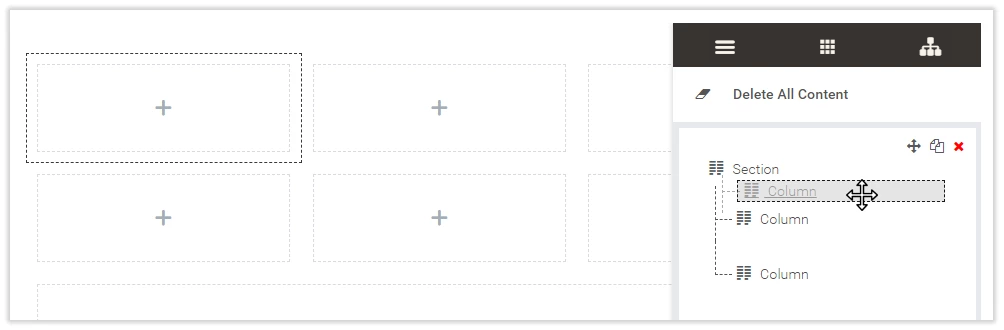
Alternatively, columns/sections can be relocated with the help of the Elements Tree in the Widgets area. Sections are represented here as blocks and columns as the content of these blocks. Hovering the cursor over the section/column in the Elements Tree will highlight this section/column in the Preview area. You can change the order of the sections, relocate the columns within the sections and between the sections with the help of the drag and drop feature.
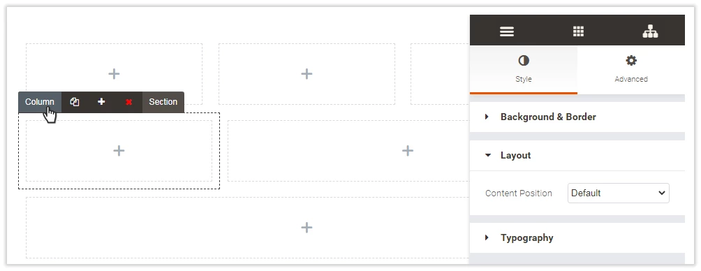
To add a column to the section, click on the Column tab and then click on the '+' icon.
To add a copy of the column in the section, click on the Column tab and then click on the 'Copy' icon.
To delete a column from the section, click on the Column tab and then click on the 'x' icon.
To tweak the configuration of the column, click on the Column tab and refer to the Widgets area (see Configuring Columns).
To add a copy of a section to the page, click on the Section tab and then click on the 'Copy' icon.
To delete a section from the page, click on the Section tab and then click on the 'x' icon.
To save a section as a template, click on the Section tab and then click on the 'Save' icon.
To tweak the configuration of the section, click on the Section tab and refer to the Widgets area (see Configuring Sections).
Alternatively, you can drag and drop widgets right into the Select Your Structure area (or the area of the Add New Structure button) to start a new one-column section consecutively placed below the ones already in use.
Configuring Layout
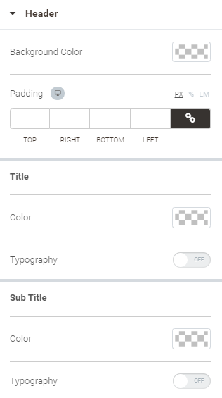
Configuring Columns
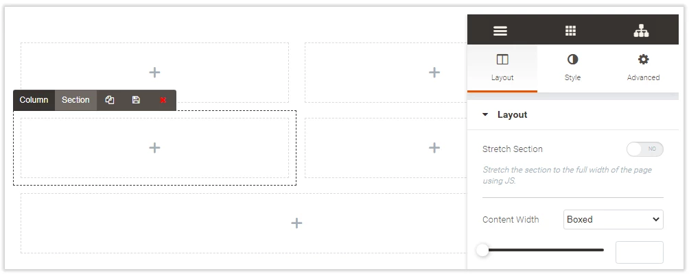
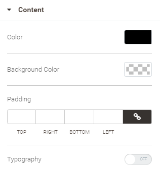
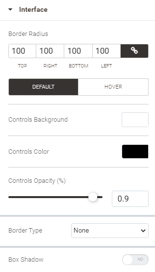
To tweak the configuration of a column, hover the cursor over the column and click on the Column tab. The Widgets area will show two tabs: Style (shown by default) and Advanced.
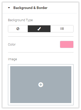
The Style tab will feature three blocks of configurations: Background & Border, Background Overlay (active when background is selected for the column), Layout and Typography.
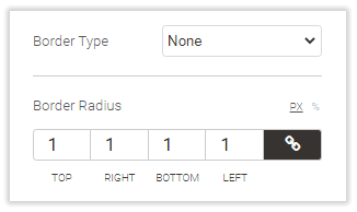
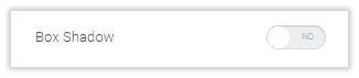
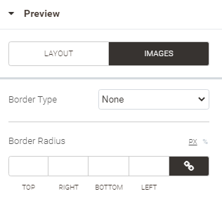
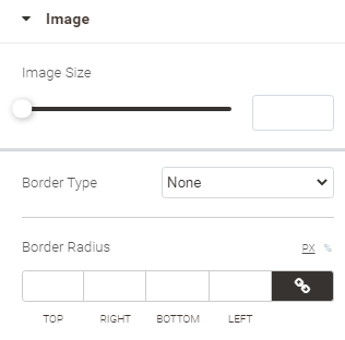
See the table below to learn more on the Background & Border configuration options.
| Background Type | Border Type and Border Radius | Box Shadow |
|---|---|---|
Background Type - None No background is applied to the column.
| Border Type - None No border is applied to the column. Border Radius is visible, though not applicable.
| Box Shadow - No No shadow is applied to the column.
|
Background Type - Classic The Classic type allows specifying a color and/or image for the background.
| Border Type - Solid/Double/Dotted/Dashed Whatever type you select for the border, you can specify its width, color and radius. Clicking on the Chain icon for width or radius will link/unlink the values for the top, bottom, left and right dimensions. When unlinked, each dimension can be set individually. You can switch between fixed and floating (%) values for the border radius with the help of the PX and % selector above the parameter.
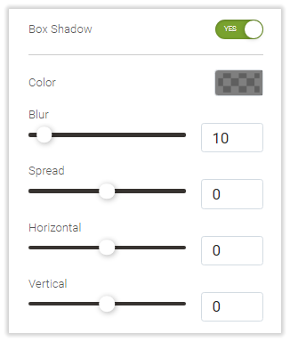
| Box Shadow - Yes When box-shadow is enabled, you can select a color for it, indicate the intensity of blur and spread, and specify the horizontal and vertical offset (from the center of the column).
|
Background Type - Gradient When gradient is selected for the background type, you can specify the following:
|


The Background Overlay block is available when the background type is Classic or Gradient. The block has similar configuration options to that of Background & Border, but for the extra Opacity option. The Opacity option is available for the Classic and Gradient background overlay types. It is meant to specify the transparency of the background overlay.
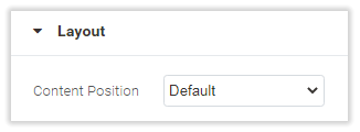
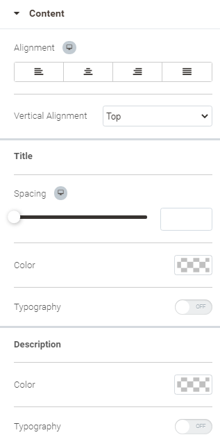
The Layout block has only one option - Content Position, which allows specifying the position of the content within the column: bottom, top (Default), middle.
Two configuration options are available for the Typography block: Colors and Text Align. The former is meant for headings, text, links and link hover. The latter allows choice between left, center and right alignment of text within the column.
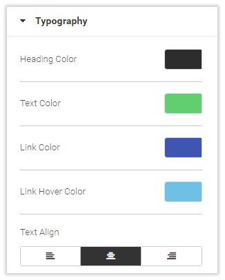
The colors indicated herein will not work if Global Colors are enabled.
The Advanced tab has two configuration blocks: Advanced and Responsiveness.
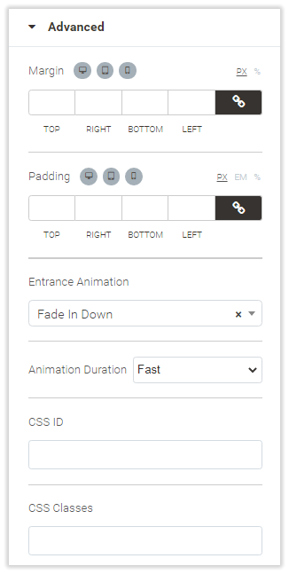
The following options are available within the Advanced block:
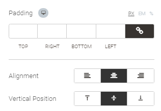
- Margin (in px or %) - the margins between the content within the column and the borders of the column;
- Padding (in px, em or %) - the padding between the content of the widget and the borders of the column;
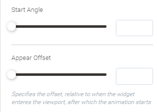
- Entrance Animation - the effect of animation for the content of the column: Fading, Zooming, Bouncing, Sliding, Rotating, Attention Seekers, Light Speed and Specials are on the list (only one effect can be chosen);
- Duration of Animation (available when Entrance Animation is set) - either of the Slow, Fast or Normal.
- CSS ID - the text field to indicate the css IDs, if any are used;
- CSS Classes - the text field to indicate the css classes, if any are used.
You can check how well your content looks like on the screens of mobile devices, given the set margins and padding, with the help of the three icons above the Margin and Padding options. Clicking on each will update the view of the content in the Preview area with regard to the chosen device.
The Responsiveness block enables to manually specify how much narrower the column is to be displayed on the screens of mobile devices. To do so, select Custom in Mobile Width and configure the Column Width.

Mobile Portrait control is no longer supported. Please use the Mobile Width instead.
Configuring Sections
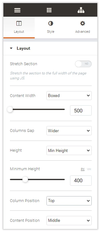
To tweak the configuration of the section, hover the cursor over the section and click on the Section tab. The Widgets area will show two tabs: Layout (shown by default), Style and Advanced.
The Layout tab features two blocks of configurations: Layout and Structure.
The Structure block allows resetting the structure of the section. Click on the Reset Structure to do so and select a new structure from the list below.
The Layout block brings forward the following options for configuration:
- Stretch Section - If Yes is selected, the section will be stretched to the full width of the page using the JS.
- Content Width - Full Width by default; when Boxed is selected, indicate the width of the box with the slider (in px).
- Columns Gap -the gap between the columns: Default, No Gap, Narrow, Extended, Wide or Wider.
- Height - Default, Fit to Screen or Min Height. If Fit to Screen is selected, the Column Position option is available. If Min Height is selected, the Minimum Height option is available too.
- Minimum Height - the slider to indicate the minimum height of the section (in px or VH).
- Column Position - the position of the column within the section: Stretch, Top, Bottom or Middle.
- Content Position - the position of the content within the section: Default, Top, Bottom or Middle.
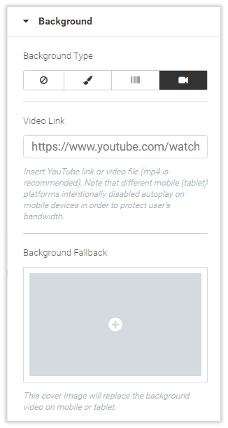
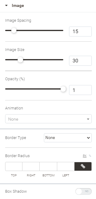
The Style tab features five blocks of configurations: Background, Background Overlay (when background is Classic, Gradient or Video), Border, Shape Divider and Typography.
The Background, Background Overlay, Border blocks and Typography for sections have the same configuration options as those in the similarly named blocks for columns. The only exception here is the Video type of the background, only available for sections. For the video background type you are suggested to indicate the link to the video (alternatively, a Youtube link) and the fallback background. The latter will replace the background video on mobile and tablet devices.
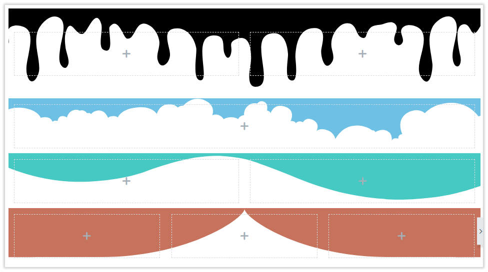
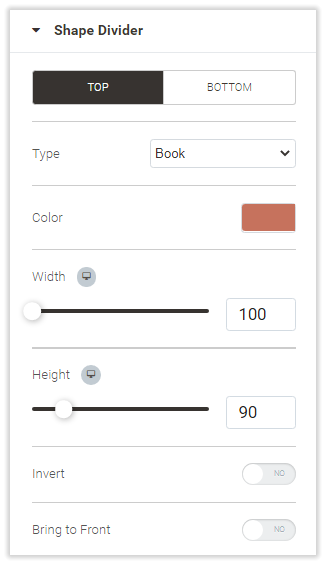
Shape Divider is a unique block of configuration options, specific for sections. This is where you can employ some pre-arranged shapes to visually separate the section from the one above and/or below it. The Top and Bottom tabs allow switching between the two dividers, configuring each separately. The list of shapes can be accessed via the Type option. Depending on the chosen shape the list of configuration options can be as follows:
- Color - the color of the shape
- Width, Height - the geometry of the shape in px
- Invert - set to Yes to fill the transparent part of the shape with the given color and discolor the colored one
- Flip - set to Yes to rotate the shape to 180 degrees
- Bring to Front - set to Yes to overlay the content of the section with the shape
| Samples of section dividers in Preview area | Sample configuration of Shape Divider |
|---|---|
|
|
The Advanced tab has two configuration blocks: Advanced and Responsive.
The Advanced tab has two configuration blocks: Advanced and Responsiveness.
The following options are available within the Advanced block:
- Margin (in px or %) - the margins between the content within the column and the borders of the section;
- Padding (in px, em or %) - the padding between the content of the widget and the borders of the section;
- Entrance Animation - the effect of animation for the content of the section: Fading, Zooming, Bouncing, Sliding, Rotating, Attention Seekers, Light Speed and Specials are on the list (only one effect can be chosen);
- Duration of Animation (available when Entrance Animation is set) - either of the Slow, Fast or Normal.
- CSS ID - the text field to indicate the css IDs, if any are used;
- CSS Classes - the text field to indicate the css classes, if any are used.
The Responsive block has the following options for configuration:
- Reverse Columns - when set to Yes and when displayed on mobile devices, the order of the columns within the section is reversed: the column at the bottom appears at the top of the section and vice versa.
- Hide on Desktop - set to Yes to hide the section when the page is viewed on desktop devices.
- Hide on Tablet - set to Yes to hide the section when the page is viewed on tablet devices.
- Hide on Mobile - set to Yes to hide the section when the page is viewed on mobile devices.
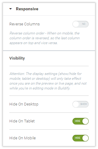
The display settings (show/hide for mobile, tablet or desktop) will only take effect once you are on the preview or live page, and not while you are in the page editing mode in Buildify.
Import and export functionality
Import Functionality
To import a template click on the Import Template button. After that, you will be able to select and upload templates in JSON format. Every time after importing a new record will be created in the "My Templates" tab.

Export Functionality
To save the template created by you click on My Templates and select the needed one and click on the Export button. When the button is clicked the template will be downloaded in JSON format. The file name will contain [name of the template]-[date of export in the format set in the locale].

Widgets
General Information
Widgets are located in the Widgets area in a searchable continuous list. The Search field is available at the top of the Widgets area within the Widgets tab.
Widgets are broken into the following categories:
- Basic - essentials for page layout customization;
- Typography - text in various forms and arrangement;
- Buttons - buttons, individual and grouped;
- General - most demanded content elements and the Magento 2 widget;
- Media - images and video, individual and in galleries;
- Icons - social media icons, individual and in lists;
- Progress - widgets to visualize progress;
- Slides - text and images in slides and carousels;
- Comments - Facebook or Disqus comments and testimonials;
- Google - Maps, Translate, Analytics and Hangout;
- Pricing - tables and lists of prices;
- Facebook - Facebook comments, posts, buttons, etc.
- Twitter - Twitter comments, posts, buttons, etc.
- Analytics - Google Analytics and Yandex Metrica;
- Modal Windows - intended for displaying all sorts of information.
To populate sections with widgets, drag the widget into the column and drop it there. You can always rearrange the layout and move widgets within sections and columns. Do that either in the Elements Tree tab in the Widgets area or directly in the Preview area. In the Elements Tree, widgets are displayed as sub-elements of columns. In the Preview area, widgets are instantly visualized as per the content they embody. Sample data is used to visualize widgets. It can then be altered to your needs.
Configuring Widgets
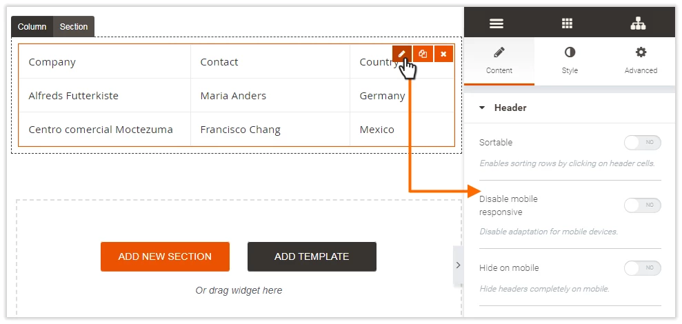
To configure a widget, hover the cursor over the content of the widget in the Preview area. An orange frame will appear around the content of the widget. Refer to the right top corner of the frame. This is where the three icons are displayed: Edit, Copy and Delete. Click on the Edit icon and refer to the Widgets area. This is where widget configuration options will be displayed.
Configuration options are broken into three tabs for each widget: Content, Style and Advanced. Depending on the content element the widget embodies, either Content or Style tabs may not be present. The Advanced tab for widgets has the same configuration options as the Advanced tab for sections. The configuration options within the Style and Content tabs vary greatly from widget to widget. See the table below for details.
Widgets in Details
Basic Widgets
Employ the Columns widget to create sections which contain multiple columns. The main difference from sections which are added to pages as one-row structures, is that you can create more advanced multi-row layouts with the Columns widget.
This is how the layout looks without (left) and with (right) the Columns widget:
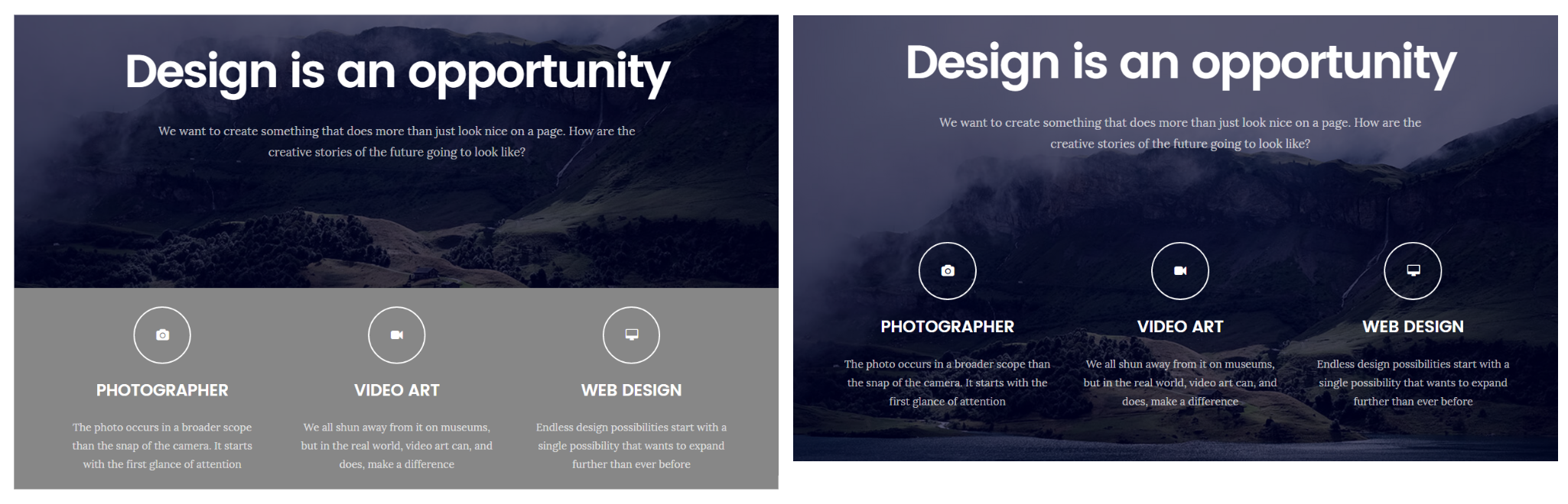
Two single-row sections are used in the example on the left: one single-column with a text and image and one three-column with icons and text. The content of each widget here fills-in exactly the column it belongs to. If you want the 3 bottom columns share the background image with the top section you will have to use the Columns widget. The result is on the right.
Configuring the Columns widget
See Configuring Sections.
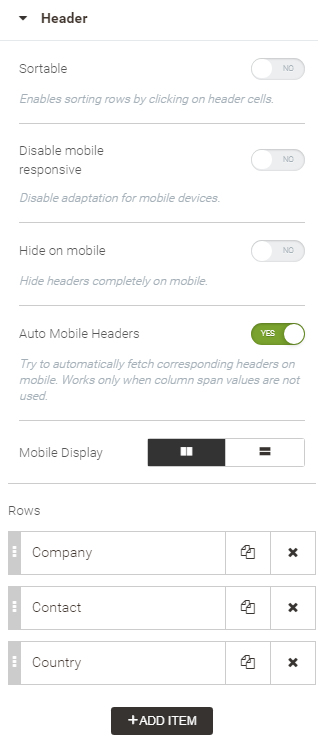
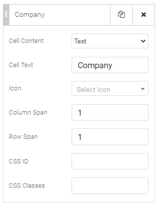
Employ the Table widget to organize data into rows and columns.
Configuring Tables
| Content | Style | Advanced |
|---|---|---|
Header block
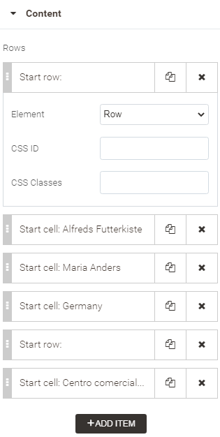
Rows can be copied and deleted in the Header block of the Table configuration options. They can, furthermore, be edited as follows:
Content block A list of rows and cells. When Row is selected as the type of the table element, you can only specify CSS styles for it as an additional configuration.
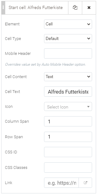
When Cell is selected as the table element, the following list of options are available for configuration:
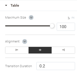
| Table block
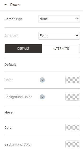
Rows block
Cells block
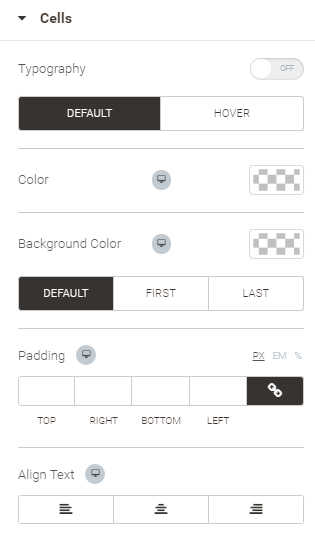
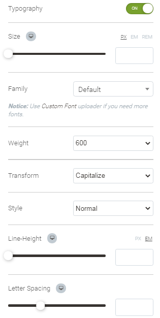
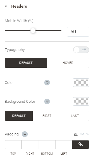
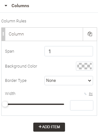
Headers block
Columns block
| See Configuring Sections |
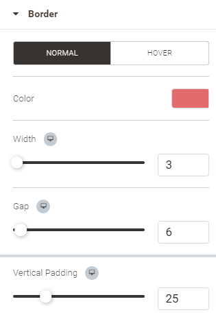
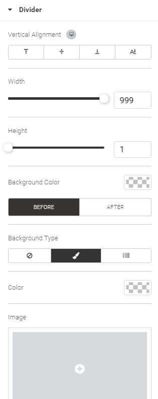
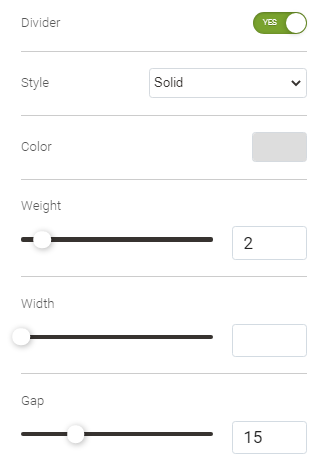
Adds horizontal lines to visually divide content. Employ the Divider widget to highlight sections and structure of content.
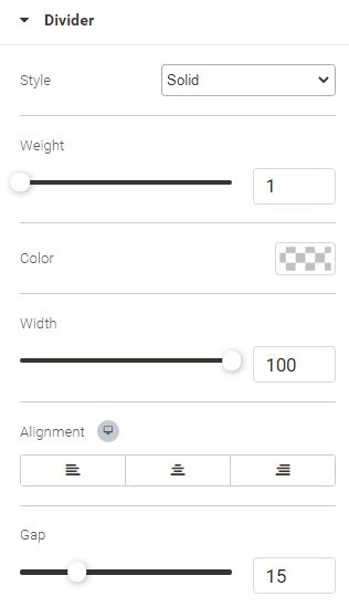
Configuring Divider
The Divider widget does not have any Style options. The Advanced options are the same as those for Sections. The Content options are presented within one block as follows:
- Style - line style: solid, double, dotted, dashed
- Weigh - brush width (1 the thinnest)
- Color - line color
- Width - line width (in %)
- Alignment - line position on the page
- Gap - the space between the divider and widgets on above and below it (in absolute value, 50 the maximum)
The Spacer widget adds vertical space separators between paragraphs, images, or other widgets. This improves the overall look of the page.
Configuring Spacer
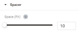
The Spacer widget does not have any Style options. The Advanced options are the same as those for Sections. The Content options are presented within one block as follows:
- Space - the gap between the spacer and widgets on above and below it
The Anchor widget helps navigate pages quickly, without scrolling endlessly or searching for a page in the main menu. A single click on an anchor will take customers exactly where they want to go: back to the top, down to the bottom or to the FAQ page.
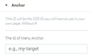
Configuring Menu Anchor
The Menu Anchor widget does not have any Style options. The Advanced options are the same as those for Sections. The Content options are presented within one block as follows:
- CSS ID - the ID of the Menu Anchor as it is described in the CSS (no # tag here)
Adds custom HTML chunks to the page.
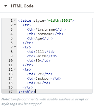
Configuring HTML
The Menu Anchor widget does not have any Style options. The Advanced options are the same as those for Sections. The Content options are presented within one block as follows:
- HTML code - the html code to be implemented on the page (Single comments with double slashes in script or style tags will be stripped).
Typography
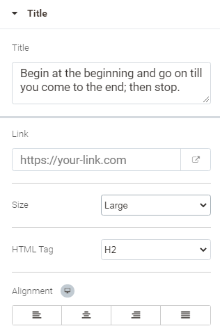
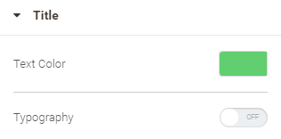
Employ the Heading widget to create headings and title texts.
Configuring Heading
| Content | Style | Advanced |
|---|---|---|
Specify here the text for the heading and the way it will be presented.
| Specify how the text of the heading will look.
| See Configuring Sections |
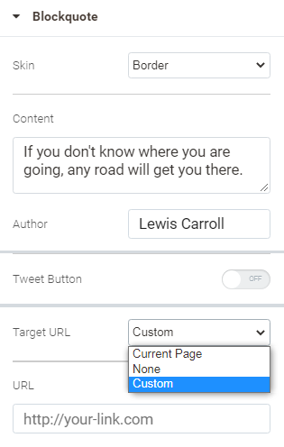
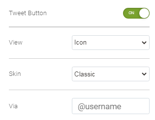
Use the Blockquotes widget to highlight the main ideas in the text or whatever important information and format it into blocks of quotes. Visitors will then be able to easily share these quotes on Twitter, for example.
Configuring Blockquote
| Content | Style | Advanced |
|---|---|---|
Specify the text of the quotation and the form of the block to contain the text.
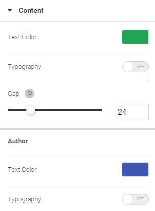
| Content block Configure how the text of the quotation and the name of the Author will be styled.
Tweet button block Specify how the Tweet Button will look.
Border block (when Border is selected for the Skin of the Blockquote) Configure how the border of the quote block is to look both in the Normal mode and when a cursor is hovered over the quote.
Similar configuration options are available for skins Quotation and Boxed. When Boxed is selected for Skin, you can specify the width of each line of the box, as well as the radius of the corners of the box and its shadow. | See Configuring Sections |
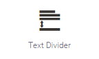
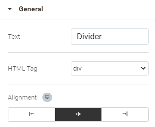
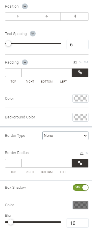
Text Divider widget is intended to break text into chapters or other logical parts.
Configuring Text Divider
| Content | Style | Advanced |
|---|---|---|
Specify what visitors will see as a text divider.
| Text block Specify how the text will look within the divider.
Divider block Specify how the divider is to be styled and presented on the frontend.
| See Configuring Sections |
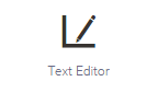
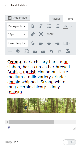
Employ Text Editor to add text to the page and edit it to the desired format.
Configuring Text Editor
| Content | Style | Advanced |
|---|---|---|
Add text and images, and edit them on the go. You can edit text either in the visual editor or HTML mode. The Drop Cap options en/disables the initial capital letter.
| Specify the advanced styling for the text you edit.
| See Configuring Sections |
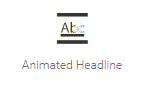
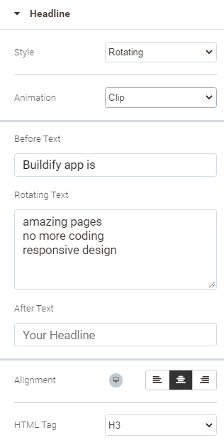
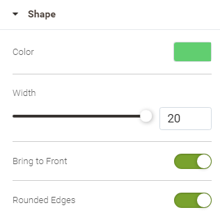
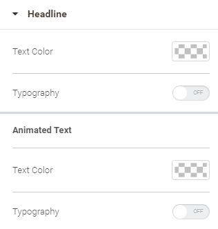
Employ Animated Headline to liven up the content and highlight the headline.
Configuring Animated Headline
| Content | Style | Advanced |
|---|---|---|
Decide on the animation style and the way it is to be presented.
| Shape block Specify the look of the shape used for the Highlighted style of animation.
Headline block Set the colors for the headline and customize other parameters of the font both for the static and animated parts of the headline.
| See Configuring Sections |
Employ the Read More widget to hide long chunks of text. When need be, users can click on the "Read More" button to read it.
This is how you can prioritize parts of the content, ease your customers’ reading and add more data about the product. Furthermore, when enabled the Read More functionality influences positively on the store ranking. Search engines will see all the content, while visitors will see what they really need to.
Configuring Read More
| Content | Style | Advanced |
|---|---|---|
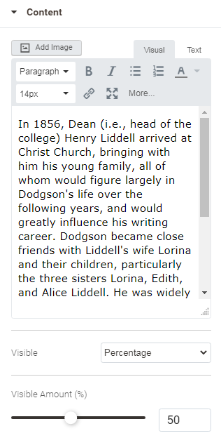
Content block Add text and images, and edit them on the go. You can edit text either in the visual editor or HTML mode. The Visible and Visible Amount options allow configuring how many lines (how much of text %) is to be shown to the viewer.
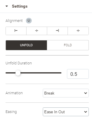
Settings block Specify the behavior of the content within the widget for both states: folded, and unfolded.
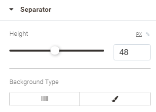
Separator block Hide or show a line of opacity as a separator between the visible and invisible parts of text.
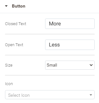
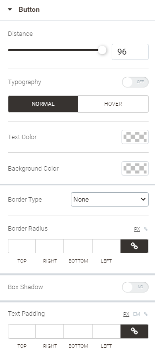
Button block Configure the button for both states of the content: closed and open.
| Content block Specify the styling of the content of the widget.
Separator block Specify how the height and background type for the content separator.
Button block Specify how the Read More button is to look on the storefront, both when the mouse cursor is hovered over the button and when not.
| See Configuring Sections |

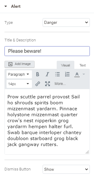
Employ the Alert widget to highlight important information or place alert/warning notes.
Configuring Alert
| Content | Style | Advanced |
|---|---|---|
Add text and images to the alert message, and edit them on the go. You can edit text either in the visual editor or HTML mode.
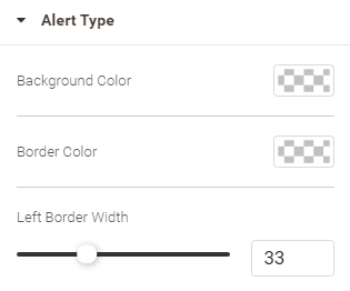
| Alert Type block Update the default colors of the alert and specify the width of the border of the alert box.
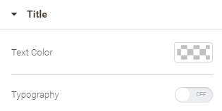
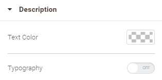
Title and Description blocks Specify the color of the headline and text of the alert. When Typography is On, more customization options will get available to format the texts.
| See Configuring Sections |
Buttons
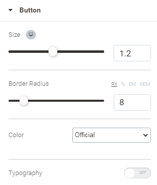
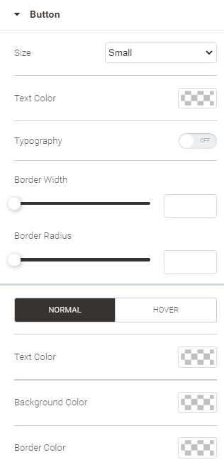
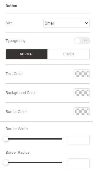
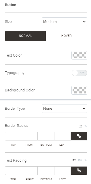
Employ the Button widget to add buttons to the page.
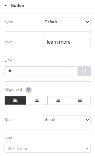
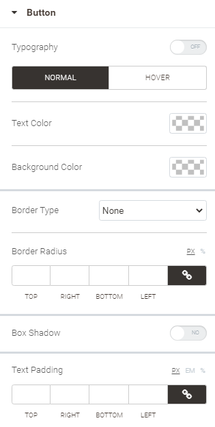
Configuring Button
| Content | Style | Advanced |
|---|---|---|
| Specify how the button is to look on the storefront, both when the mouse cursor is hovered over the button and when not.
| See Configuring Sections |
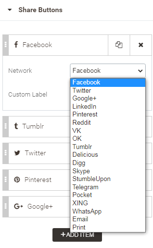
Employ Share Buttons to add a group of buttons that allow sharing your content to social networks.
Configuring Share Buttons
| Content | Style | Advanced |
|---|---|---|
Add buttons to the group and specify which social networks they are to share your content to. If the Network list does not contain the media resource, indicate its name in the Custom Label field. You can change the order of the buttons in the group, copy-paste, delete and add buttons here.
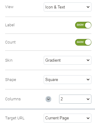
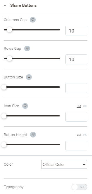
| Configure the look of the Share Buttons box here.
| See Configuring Sections |
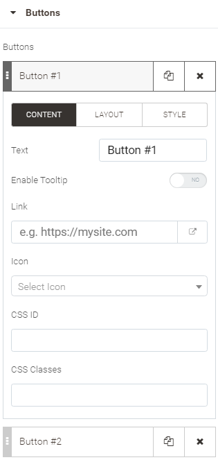
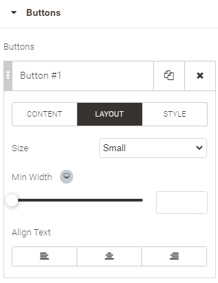
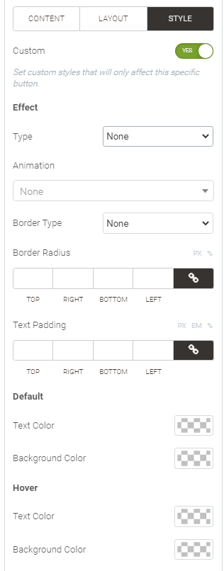
Add groups of buttons to the page as a customizable block thereof.
Configuring Buttons Group
| Content | Style | Advanced |
|---|---|---|
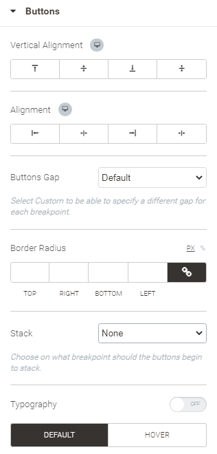
Buttons block Create buttons and group them appropriately. You can create as many buttons as you need. Add, shuffle, edit and delete buttons here. To edit a button, click on the button name on the list. You will then be able to choose one of the three sets of configuration options to tweak:
2. Layout
3. Style Custom - set to Yes to enable more configuration options to override default style settings for the button:
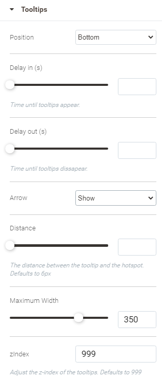
Tooltips block Refer to this block of options if tooltips are enabled for the buttons.
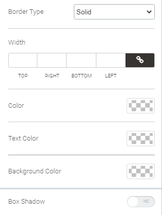
| Buttons block Specify the styling of the buttons.
Next set of configuration options are available both for the Default and Hover states of the buttons:
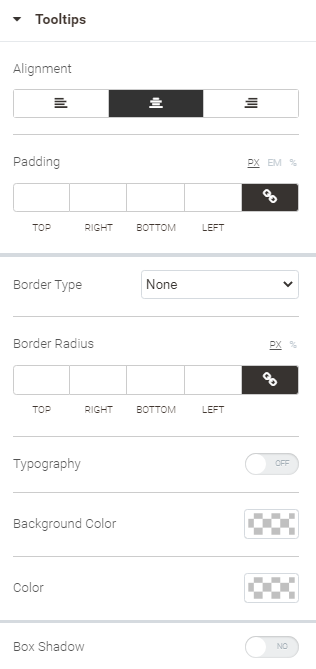
Tooltips block Configure the styling of the tooltips.
| See Configuring Sections |
General
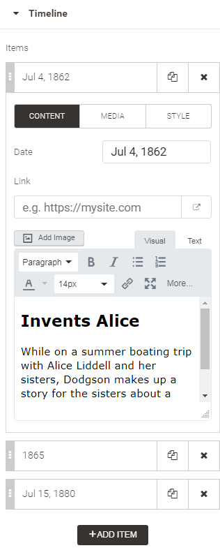
Use the Timeline widget to add a timeline to the page. Timelines present content chronologically, thereby facilitating its visual perception. A timeline here is a vertical line with stops along the line to represent milestone events. Each event is presented as a combination of icons, notes and descriptions.
Configuring Timeline
| Content | Style | Advanced |
|---|---|---|
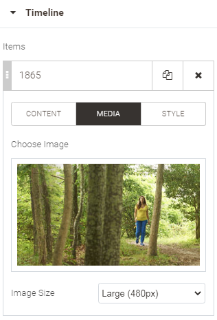
Specify the information to feature within the elements of the timeline. The timeline events are collected into a list. You can shuffle the list, add, copy and delete events. To add an event, click the Add Item button below the list. There are three sets of configuration options available for each event on the list: Content, Media and Style.
2. Media Choose an image to complement the description of the event, and set its size.
3. Style When Custom is set to Yes, configure the colors and scale of the timeline event elements. Do that for the Default, Hover and Focused states of the elements. For each state you can select an icon to feature within the point, the background of the point, icon color, card background (description box), date color and the scale of the event.
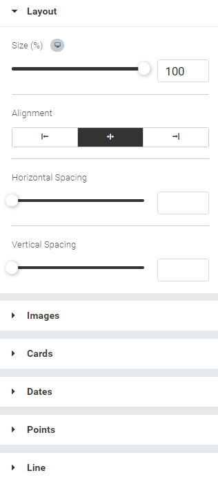
| Specify the look of the elements of the timeline events: the general layout, images, cards (description boxes), dates, points and the line. With view to the specifics of each element, the configuration options on offer will vary, but on average they will present some generic styles like Size, Alignment, Spacing, Padding, Border Radius and Colors. The Points and Cards (when Animate Cards is On) elements will require configuring the above for the three possible states: Default, Hover and Focused. Alignment here is the position of an element against the container: for example right, center, left. Spacing is the distance between the elements of content within the container. Padding is the distance between the content and the borders of the container.
| See Configuring Sections |

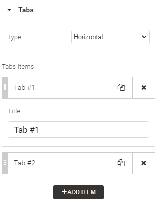
Tabs separate content into multiple sections, accessible by clicking on a corresponding tab above the sections. By default, each tab has one section of one column. This widget will help save space on the page and will allow you to add as much content as you need.
Configuring Tabs
| Content | Style | Advanced |
|---|---|---|
Manage the list of tabs here: add, copy, delete, shuffle and edit tabs. Clicking on the list item, allows editing the name of the tab. Clicking on the Add Item button, adds another item to the list. There are two types available for the layout of the tabs: horizontal and vertical. Choose one with the help of the corresponding option.
| Specify the styling of the tabs, namely:
| See Configuring Sections |

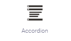
Collect content into a vertically stacked list of tabs with the Accordion widget. Each tab has a single section of one column inside to welcome content. The content is hidden when the tab is inactive. To activate the tab and unfold the content, click on the tab. Clicking on the tab again closes its content. Activating a tab when other tab is active closes the content of the previously active tab and unfolds the content of the newly-activated one.
Hiding content with the help of accordion tabs facilitates searching for sections, chapters or questions since one does not have to browse through long passages of content. FAQ pages frequently employ an Accordion widget.
Configuring Accordion
Since the concept of Accordion is based on tabs, the configuration options here are the same as for the Tabs widget. See Tabs for further details.
The only difference concerns the Navigation width parameter (Style) for Tabs, which is substituted with Icon Alignment (left/right) for Accordion.
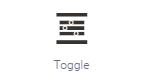
Toggle is similar to Accordion, the function and concept are the same. At the same time, Toggle allows having all tabs open at the same time.
Configuring Toggle
See Tabs for further details. The Navigation Width parameter (Style) for Tabs is not present here.
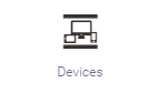
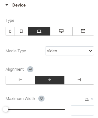
Employ the Devices widget to play video in a frame of a device.
Configuring Devices
| Content | Style | Advanced |
|---|---|---|
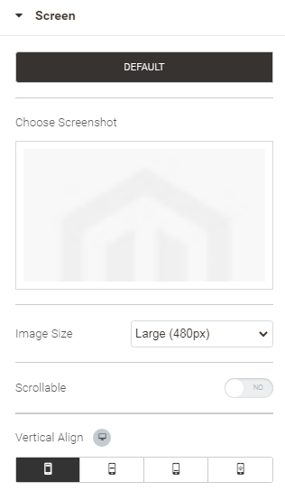
Device block Choose and configure the frame of the device here.
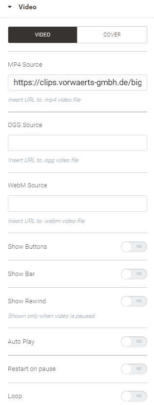
Video block (available when video is selected as a type of media) Specify the video and cover resource and suggest some playback control features. A cover here is an image. Clicking on the Cover tab in the Video block, will ask you to upload or choose an image.
Screen block (available when Image is selected as a type of media) Select the image to be displayed within the frame. Select two images for mobile devices. Do that with the help of the Default and Landscape tabs.
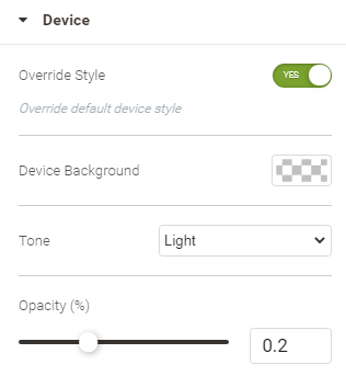
| Device block Override default device styles. To override some default styles used by Devices, set Override Style to Yes. The following configuration options will get available:
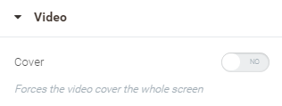
Video block (available when Video is chosen as the Media Type) Set Cover to Yes for video to cover the whole screen of the chosen frame.
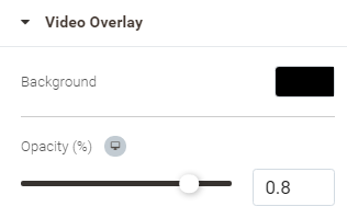
Video Overlay block Select the color of the device screen, that is the Background of the video, and the intensity of thereof.
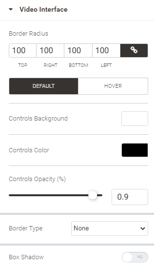
Video Interface Specify the styles of the playback control elements of the device: play, stop, etc. Do that for the two states thereof: Default and Hover.
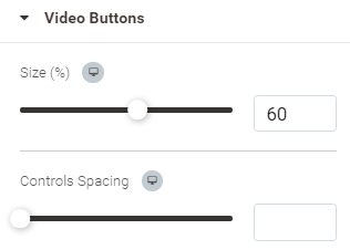
Video Buttons
|
Employ native Magento 2 widgets to add content representing your store data.
Drag and drop the widget into the Preview area and refer to the Widgets area. Two tabs are available there for Widget: Content and Advanced. The latter has the same configuration options as those in Configuring Sections. The former shows selected widget and the Select Widget button. Only one widget can be selected at a time with the help of the Widget (native Magento 2) widget.
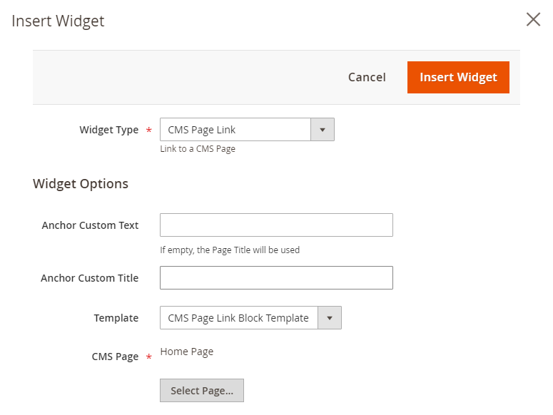
Clicking on the Select Widget button opens a popup prompting to specify the type of the widget and the details thereof. When done with the configuration, click on the Insert Widget button in the top right of the popup to complete the job.
Inserting a widget does not create a widget instance.
CMS Page Link
Displays a link to a specific CMS page. Allows specifying custom text and title.
The following configuration options are available for CMS Pake Link:
- Anchor Custom Text - the text to contain the hyperlink to the CMS page
- Anchor Custom Title - the text to appear in the tooltip to the anchor text (visible when hovering the cursor over the anchor text)
- Template - one of the two templates available for the widget
- Page - the name of the page to be redirected to on click of the anchor link. To specify the page, click on the Select Page button. A popover will emerge, prompting to select a page from the grid.
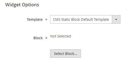
CMS Static Block
Displays a block of content at a specific location on a page.
The following configuration options are available for CMS Static Block:
- Template - the template of the widget
- Block - the name of the block to feature in the widget. To specify the block, click on the Select Page button. A popover will emerge, prompting to select a block from the grid.
Catalog Category Link
Displays either an inline or block-style link to a selected catalog category.
The configuration options here are similar to those for CMS Page Link, but that you specify them for a category.
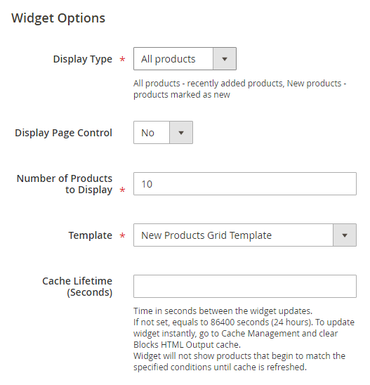
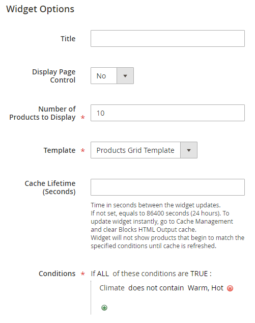
Catalog New Products List
Displays a block of products which have been designated as new, for the duration of time specified in the product record.
The following configuration options are available for Catalog New Products List:
- Display type - the type of products to display: All product or New Products
- Display Page Control - set to Yes to display page controls (buttons Next, Back, etc) alongside the product list content. The Number of Products per Page option is added when Display Page Control is set to Yes. This is where you indicate the number of products to be displayed within the list. Page controls then enable pagination, i.e. moving from one part of the list to the other.
- Template - the template of the widget
- Cache Lifetime - the time between widget updates (in seconds)
Cache Lifetime
If not set, the value of Cache Lifetime equals to 86400 seconds (24 hours). To update the widget instantly, go to Cache Management and clear the Blocks HTML Output cache. The widget will not show products that begin to match the specified conditions until cache is refreshed.
Catalog Product Link
Displays either an inline or block-style link to a selected catalog product.
The configuration options here are similar to those for CMS Page Link, but that you specify them for a catalog.
Catalog Product List
Displays a list of products from the catalog.
The configuration options here are similar to those for CMS Page Link, but for the following two:
- Title - the title of the product list
- Conditions - the filter for the products to appear on the list. Click on the "+" icon to add a condition, click on the "X" icon to delete a condition. Clicking on the capitalized words in bold (All, True, etc) will open choices to specify conditions.
Orders and Returns
Gives guests the ability to check the status of their orders and submit requests to return merchandise. The widget appears only for guests and customers who are not logged in to their accounts.
The widget requires a choice of a template. Do that with the help of the Template option.
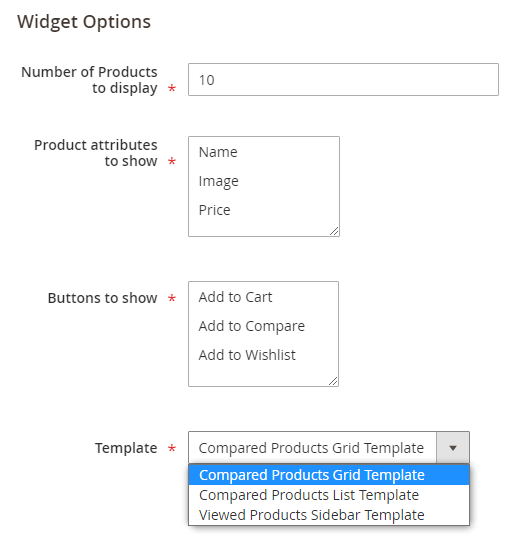
Recently Compared Products
Displays the block of recently compared products. You can specify the number of products included, and format them as a list or product grid.
The following configuration options are available for Recently Compared Products:
- Number of Products to Display - the whole numeric to indicate the number of recently compared products to be displayed to the viewer
- Product attributes to show - select the product attributes to be shown alongside the products
- Buttons to show - select the button to be shown alongside the products
- Template - the template of the widget
Recently Viewed Products
Displays the block of recently viewed products. You can specify the number of products included and format them as a list or product grid.
The following configuration options are available for Recently Viewed Products:
The configuration options here are similar to those for Recently Compared Products, but that you specify them for recently viewed products.
Media
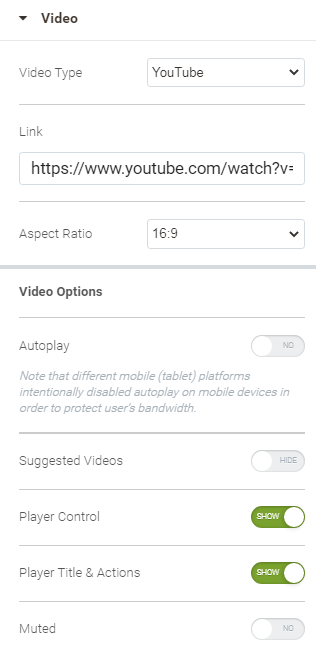
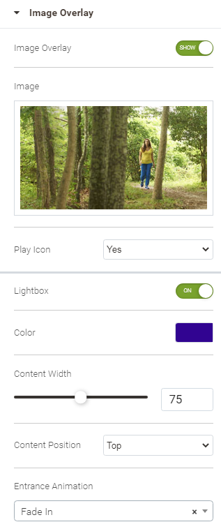
Employ Video widget to embed videos. The resources for videos here are: Youtube and Vimeo.
Configuring Video
See Configuring Sections for Advanced settings, Style is not available for Video. The Content tab shows two blocks of options: Video and Image Overlay.
| Video block | Image Overlay block |
|---|---|
Suggest a video here and specify some playback options.
Different mobile (tablet) platforms intentionally disable autoplay on mobile devices in order to protect user’s bandwidth.
| Suggest an image overlay and tweak lightbox parameters, if any.
|
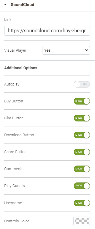
Employ Video widget to add Soundcloud audios to the content of the page.
Configuring Video
See Configuring Sections for Advanced settings, Style is not available for Soundcloud. The Content tab allows specifying the following:
- Link - the link to the SoundCloud audio file
- Visual Player - set to Yes to enable a visual player
- Additional Options - set Yes to Autoplay to enable automatic re-play of the audio, decide which control buttons are to be shown, and what would be their color.
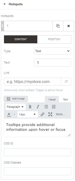
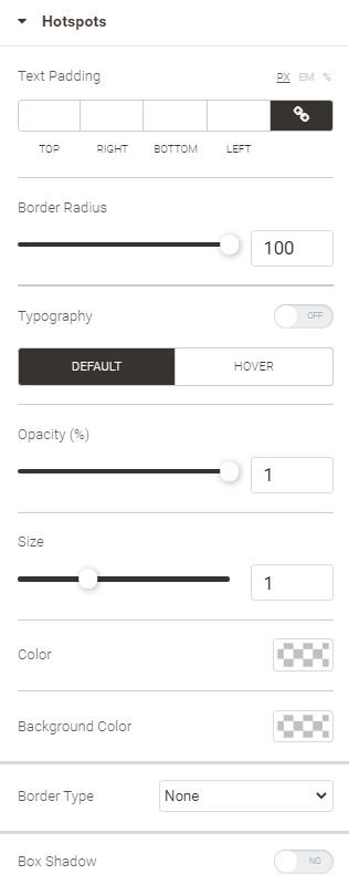
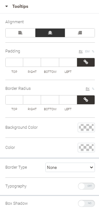
Mark up parts of the image and provide them with descriptions hidden within the tooltips. To mark the image up, hotspots are used. Hotspot is an animated circle area, containing some text, if need be, to attract viewers' attention to a part of the image. A tooltip appears on hovering the cursor over the hotspot. Placing some description within the tooltip box may explain the area of the image you wanted to highlight.
Configuring Image Tooltips
| Content | Style | Advanced |
|---|---|---|
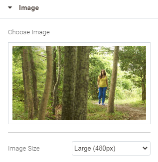
Image block Specify the image and suggest the size thereof.
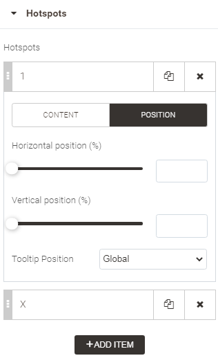
Hotspot block Add hotspots and configure their content and positions. Hotspots are collected within a list. You can shuffle, add, copy and delete hotspots. Clicking on a list item will open configuration options for the hotspot. There are broken into two sets: Content and Position. The buttons that give access to the sets are named correspondingly.
2. Position
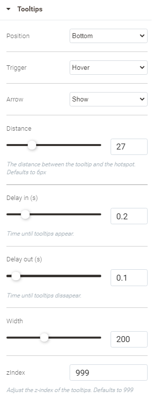
Tooltips block
| Image block Specify the styling of the image.
Hotspot block Specify the styling both for the Default and Hover states.
Tooltip block Specify the styling of tooltips.
| See Configuring Sections |
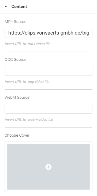
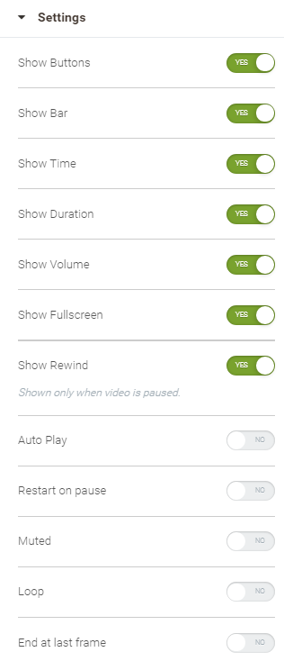
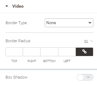
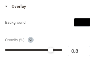
Employ HTML5 Video to insert videos with the help of the <video> tag.
Configuring HTML5 Video
| Content | Style | Advanced |
|---|---|---|
Content block Specify the video and cover resources.
Settings block
| Video block Specify the look of the video box to play the video on the page.
Overlay block Select the color of the video box background, and specify the intensity of it.
Interface block Specify the styles of the playback control elements of the video box: play, stop, etc. Do that for the two states thereof: Default and Hover.
Buttons block
Bar block Specify the styles of the control bar.
| See Configuring Sections |
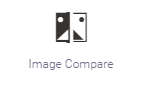
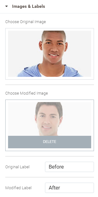
Employ Image Compare to add two images to the page. The images come in one box, one next to the other. Such layout facilitates visual comparing of images. By default, images are displayed in half in the image comparison box. A handle is available in the center of the box. Dragging the handle to the side will reveal the hidden part of one of the images, and will cover the corresponding part of the other image.
Configuring Image Compare
| Content | Style | Advanced |
|---|---|---|
Image and Labels block Suggest the two images for comparison and specify the labels to explain the images.
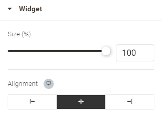
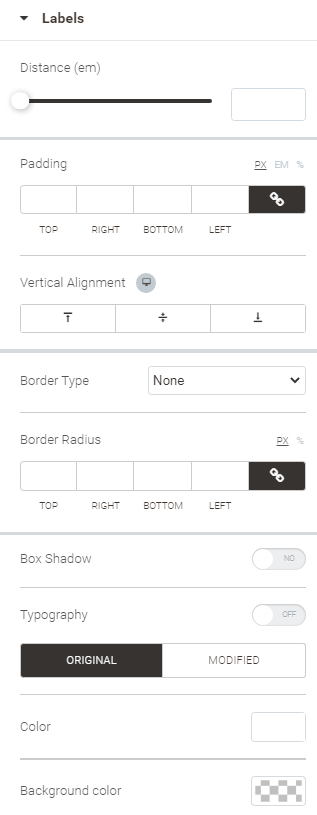
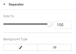
| Widget block
Labels block Tweak the look of the labels.
You can set different colors for the Original and Modified labels.
Separator block
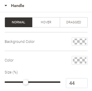
Handle block Specify the colors and size for the handle here. Do that for the three states: normal (default), Hover (when cursor is hovered over the handle) and Dragged (when the handle is dragged to the side).
| See Configuring Sections |
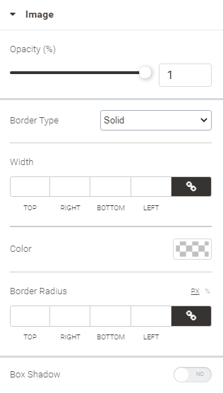
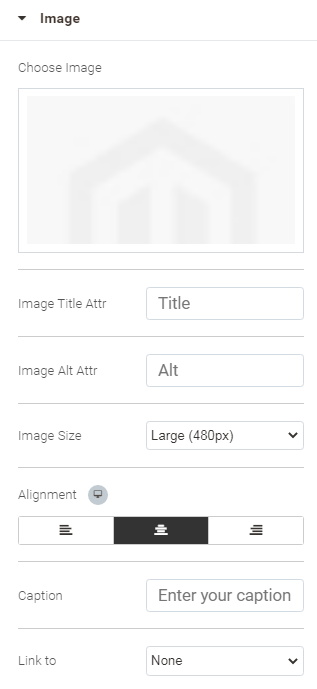
Add an image to the page.
Configuring Image
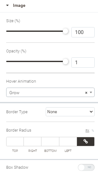
| Content | Style | Advanced |
|---|---|---|
Upload/Select an image and specify some details for it.
| Image block Specify the styling for the image.
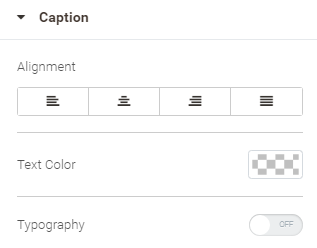
Caption block
| See Configuring Sections |
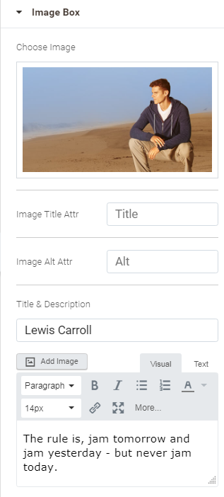
Add an image box to the page. An image box contains an image, a headline and description of the image.
Configuring Image Box
| Content | Style | Advanced |
|---|---|---|
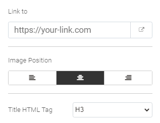
Upload/Select an image and suggest the headline as well as the description.
| Image block
Content block
| See Configuring Sections |
Adds a gallery of images.
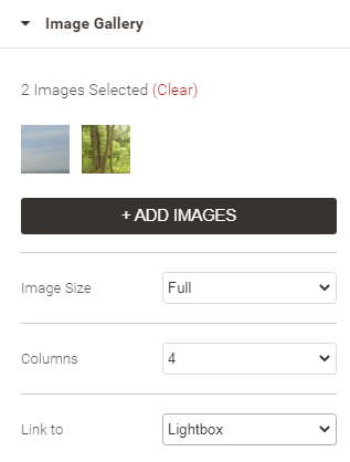
Configuring Image Gallery
| Content | Style | Advanced |
|---|---|---|
Image Gallery Add images and tweak the layout of the gallery. Click on the Add Images button to upload/select images.
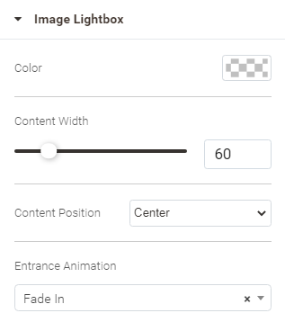
Image Lightbox (available when Lightbox is selected for Link to in the Images block) A lightbox is an area to preview images, which takes the whole space of the page when activated and hides any content but for the image gallery. Page content is overlayed by the background of the lightbox. The lightbox can be closed any time. The use of a lightbox helps focus viewers' attention on the image gallery.
| Images block
Caption block
| See Configuring Sections |
Icons
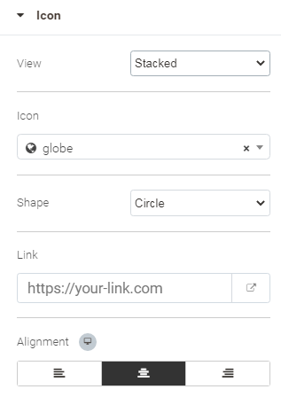
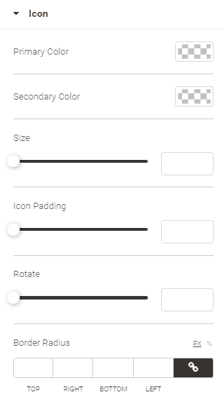
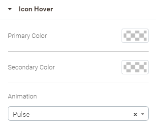
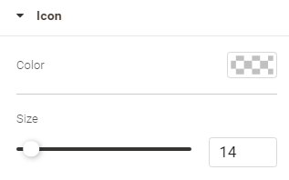
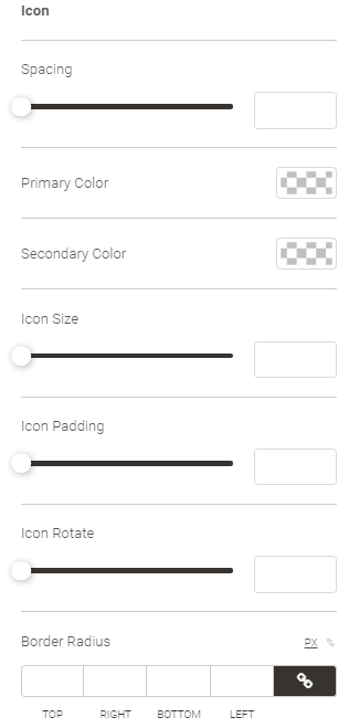
Add an icon to the page.
Configuring Icon
| Content | Style | Advanced |
|---|---|---|
| Icon block Specify the styling for the icon.
Icon Hover block Specify the colors and the animation that will be displayed on hovering a cursor over the icon.
| See Configuring Sections |
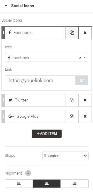
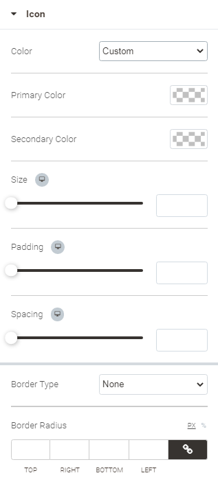
Add icons of social networks and assign links to them.
Configuring Social Icons
| Content | Style | Advanced |
|---|---|---|
Find the list of social icons here. You can shuffle, add, delete and edit the icons on the list. To edit an icon, click on the corresponding item on the list. The configuration options will get unfolded:
| Icon block Specify the styling for the icon.
Icon Hover block Specify the colors and the animation that will be displayed on hovering a cursor over the icon. Colors configuration is available only when Custom is selected for Icon Color.
|
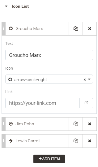
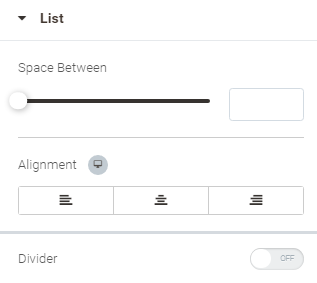
Add a list of icons with text descriptions and links.
Configuring Icon List
| Content | Style | Advanced |
|---|---|---|
Find the list of icons here. You can shuffle, add, delete and edit the icons on the list. To edit an icon, click on the corresponding item on the list. The configuration options will get unfolded:
| List block
Icon block
Text block
| See Configuring Sections |
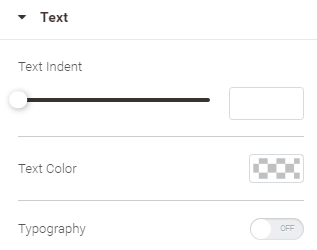
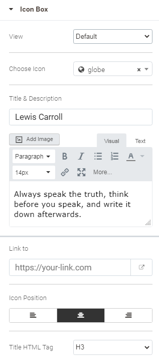
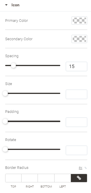
Add a box containing an icon, icon title and description.
Configuring Icon Box
| Content | Style | Advanced |
|---|---|---|
Upload/Select an icon and suggest the headline as well as the description.
| Icon block Specify the styling for the icon.
Icon Hover Specify the colors and the animation that will be displayed on hovering a cursor over the icon. Colors configuration is available only when Custom is selected for Icon Color.
Content block
| See Configuring Sections |
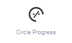
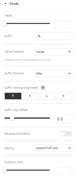
Progress
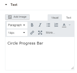
The Circle Progress widget is used to show an animated progress (loading) circle-bar representing a percent value towards the completion of some operation. The circle-bar comes with a text inscription meant to provide explanation on the visualized statistics.
Configuring Circle Progress
| Content | Style | Advanced |
|---|---|---|
Circle block
Text block Add text or/and image to the circle-bar. Provide explanations, give definition or just state the title for the diagram. You can use either the visual or HTML editor to format the text.
| NA | See Configuring Sections |
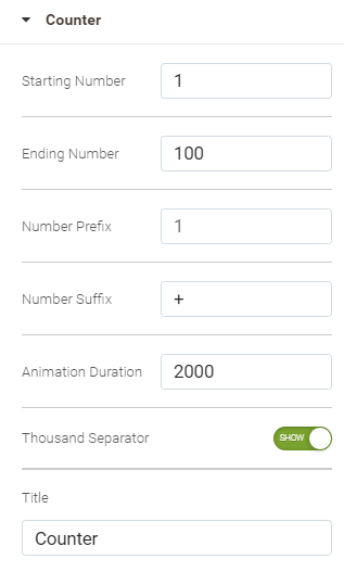
Add an animated counter. Counters allow displaying, for example, the number of users who have visited your site, the number of comments users have left, the number of posts you have published, etc. in a visually pleasing way.
Configuring Counter
| Content | Style | Advanced |
|---|---|---|
| Configure here the color and some typographic parameters for the number and title of the counter.
| See Configuring Sections |
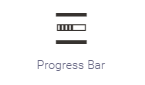
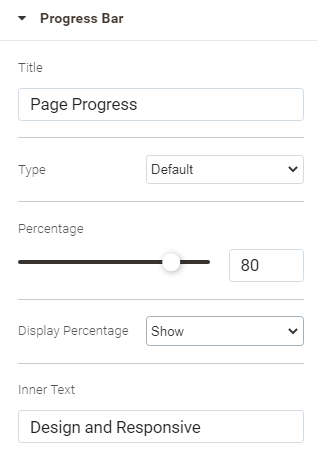
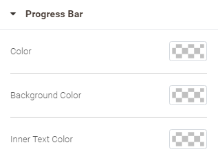
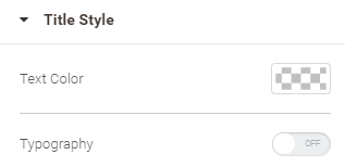
Add a progress bar. The Progress Bar widget allows showing the User how far he/she has advanced with some operation.
Configuring Progress Bar
| Content | Style | Advanced |
|---|---|---|
| Specify the colors for the progress bar and the title. When Typography is set to ON the following configuration options will appear to style the text of the title: size, font, style, letter spacing, etc
| See Configuring Sections |
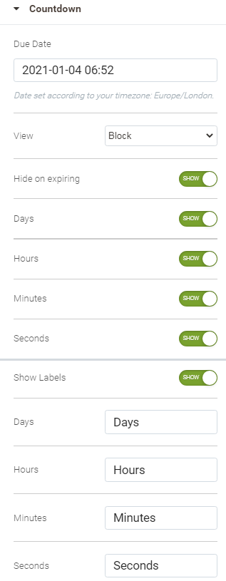
The Countdown widget allows displaying the countdown towards some event.
Configuring Countdown
| Content | Style | Advanced |
|---|---|---|
| Boxes block
Content block Specify the colors for the digits and the labels. When Typography is set to ON the following configuration options will appear to style the text of the digits/labels: size, font, style, letter spacing, etc
| See Configuring Sections |
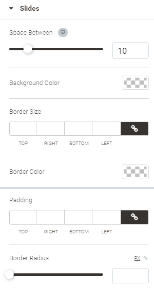
Slides
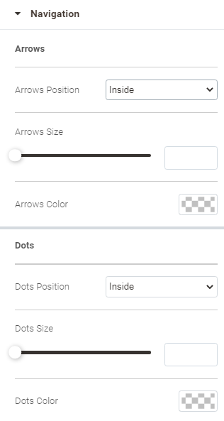
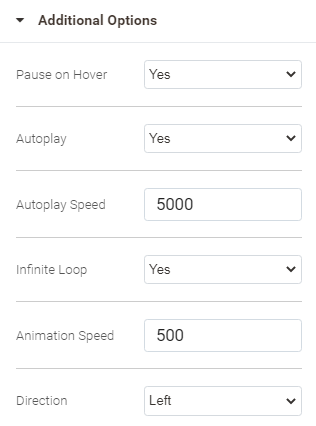
Employ the Slides widget to add content sliders onto the page. Sliders make content more dynamic and engaging. A slide contains a text, image and button. A few slides make up a slider. To switch between the slides, a slider has some navigation elements: arrows - to switch the slides one after the other, and buttons - for the choice of a slide on the list.
Configuring Slides
| Content | Style | Advanced |
|---|---|---|
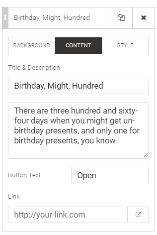
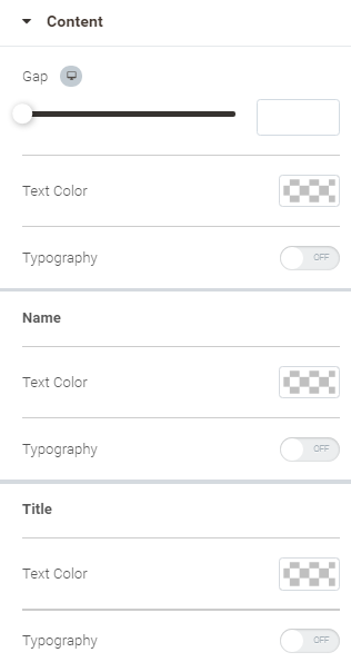
Slides block Find the list of the slides here. Add, shuffle, delete, copy and edit the slides here. Click on the item on the given list to open the configuration options for the chosen slide. These are broken into the three categories: Background, Content and Style.
2. Content
Leave these fields blank to display only the background on the slide.
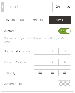
3. Style Set Custom to Yes to customize the positioning and color of the title, description and button for the chosen slide. Default styling settings can be set for all slides in the Style tab (see the column on the right).
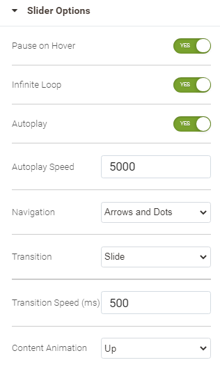
Slider Options block Specify the behavior and animation of the slider.
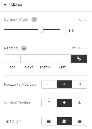
| Slides block Specify the positioning of the content within the slides.
Title & Description blocks Specify the colors, spacing and font styles for the title and description of the slider. When Typography is set to ON the following configuration options will appear to style the text of the title and description: size, font, style, letter spacing, etc
Button block Specify how the button is to look on the storefront, both when the mouse cursor is hovered over the button and when not.
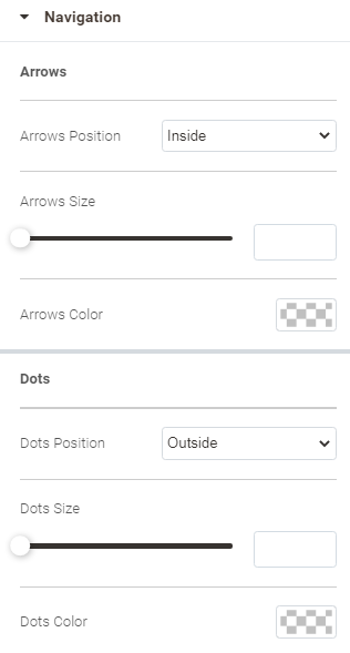
Navigation block Specify the look of arrows and bullets (aka dots) used to slide the content within the slider to the right/left. Configure the position (Inside, Outside the slider), size and color of these navigation elements.
| See Configuring Sections |
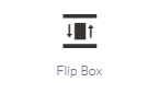
The Flip Box widget allows adding animated boxes that flip to the side when the visitor hovers the cursor over them. A flip box has two sides, so only two versions/copies of content can be displayed with the help of a flip box as compared to a slider, where multiple copies can be presented. Flip boxes make content more dynamic and engaging. A flip box contains a text, icon, image and button.
Configuring Flip Box
| Content | Style | Advanced |
|---|---|---|
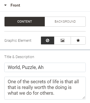
Front block The front side of a flip box is displayed to the viewer on load of the page. It is aimed at attracting the viewer's attention to the subject matter, thereby it can welcome either an image or icon alongside the text. The latter makes up the content of the flip box front. Use the Content tab to access the respective configuration options. Click on the Background tab to customize the background of the flip box side (see Configuring Columns for details).
Leave the Title & Description fields blank to display only the background (icon or image) on the front side. When Image is selected as a graphic element, upload/select an image, specify the alternative attributes for it and indicate the size of the image. Alternative attributes are essential for successful SEO practices. When Icon is selected as a graphic element, select an icon and decide if it is to be enclosed within a shape. You can select either a square or circle shape, filled or with just a border line.
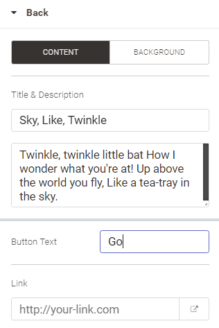
Back block The back side of a flip box is meant to call for actions, thereby it contains a button alongside some text. The configuration options here as similar to those described above, but for the options specific to the use of buttons:
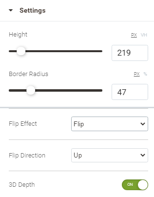
Settings block
| Specify the styling of the content of the flip box. The configuration options here are split into the two blocks: Front and Back. Both blocks have similar settings with regard to the content they can display.
Specify the look of the text on the flip box
Specify how the button is to look on the storefront, both when the mouse cursor is hovered over the button and when not:
Specify how the icon is to look on the back side of the flip box.
| See Configuring Sections |
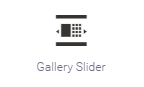
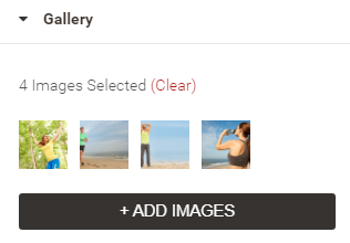
The Gallery Slider widget allows viewing images in a slideshow manner. The Gallery Slider consists of two areas: image gallery and image slider. Images can be viewed in a gallery as thumbnail copies, or in a slider as full-size copies. The slider plays images automatically, one after the other. Viewers can select an image to preview in the slider from the gallery.
Configuring Gallery Slider
| Content | Style | Advanced |
|---|---|---|
Gallery block Select/upload images here. Click on the Add Images to do so. Click on the image thumbnail to delete it from the list. Click on Clear to delete all images from the list in a go.
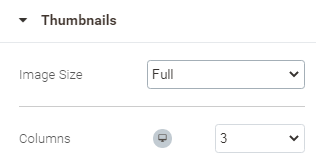
Thumbnails block Specify the size of the images as they will appear in the gallery part of the widget. Indicate the number of columns for the gallery to have.
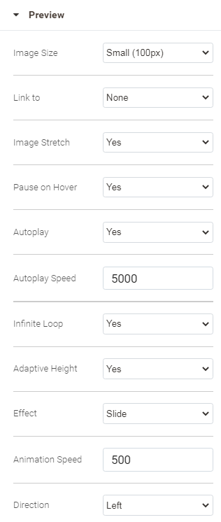
Preview block Configure the work of the slider as part of the widget.
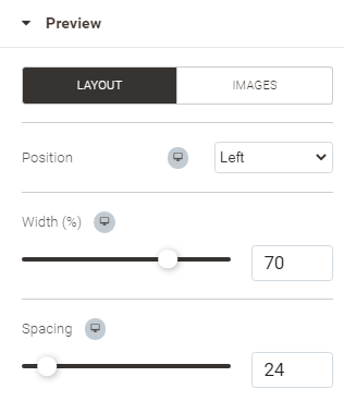
| Preview block Configure the layout for the slider part of the widget. Click on the Layout button at the top of the block.
Click on the Images button at the top of the block to configure the look of the images in the slider.
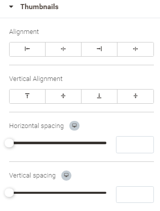
Thumbnails block Specify the look of the gallery as part of the widget.
You can specify the above settings differently for the three states of the thumbnail images: default, Hover and Active
You can specify the above settings differently for the three states of the thumbnail images: default, Hover and Active
| See Configuring Sections |
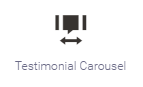
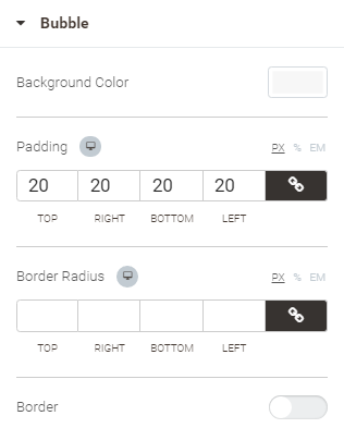
Use the Testimonial Carousel widget to organize testimonials into an attractive content slider block.
Make use of testimonials, the proof of your clients’ loyalty to your brand. Testimonials make a positive impact on the people who are visiting your site for the first time.
Configuring Testimonial Carousel
| Content | Style | Advanced |
|---|---|---|
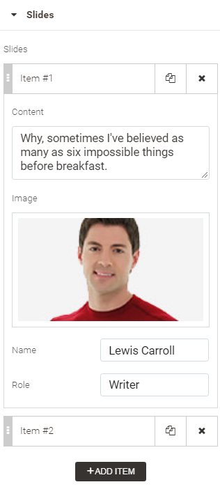
Slides block Slides consist of the text of the testimonial, author's signature and avatar. This is where you can find a list of all slides in the carousel. Add, shuffle, delete, copy and edit slides here.
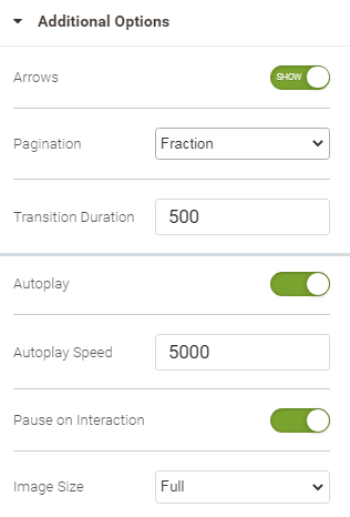
Additional Options block
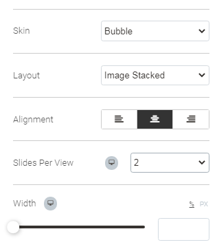
| Slides block Specify how slides are to look as part of the carousel.
Content block
Image block
Navigation block
Bubble block
| See Configuring Sections |

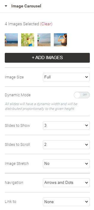
Add a dynamic gallery to the page with the help of the Image Carousel widget.
Configuring Image Carousel
| Content | Style | Advanced |
|---|---|---|
Image Carousel block Add images to the carousel with the help of the Add Images button. To delete selected images, click on the image on the list. To clear the list, click on the Clear active link. The following options are available to configure the carousel:
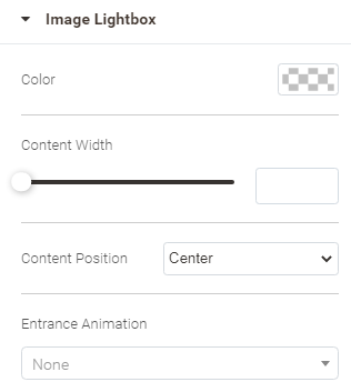
A lightbox is an area to preview images, which takes the whole space of the page when activated and hides any content but for the image carousel. Page content is layered over by the background of the lightbox. The lightbox can be closed any time. The use of a lightbox helps focus viewers' attention on the image carousel.
Image Lightbox (available when Lightbox is selected for Link to in the Image Carousel block)
Additional options
| Navigation block Specify the look of arrows and bullets (aka dots) used to slide the content within the slider to the right/left. Configure the position (Inside, Outside the slider), size and color of these navigation elements.
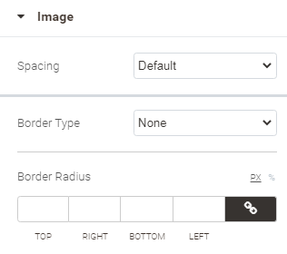
Image block Specify the look of the images in the carousel.
 |
Comments
The Facebook Comments widget allows viewers to comment on the content on your site using their Facebook accounts. People can choose to share their comment activity with their friends (and friends of their friends) on Facebook as well. The comments plugin also includes built-in moderation tools and social relevance ranking.
The following configuration options are available to set up the widget:
- Alignment - the alignment of the widget within the column
- URL to comment on - the URL of a website you want to use with the comments widget
- Number of posts - the number of posts you want to show
- Width - the width of the widget
- Locale - the code of the country and language you want to see in the comments
- App Id - your Facebook API, if any.
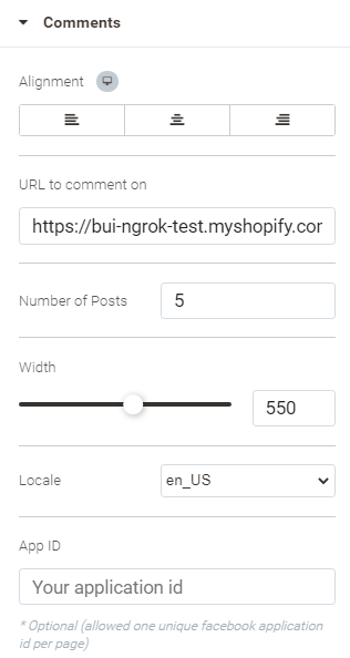
For Advanced configuration options see Configuring Sections.
More on employing Facebook comments.
Employing Embedded comments is a simple way to put comments to Facebook public posts into the content of your web page. Only public comments from Facebook Pages and profiles can be embedded.
The following configuration options are available to set up the widget:
- Alignment - the alignment of the widget within the column
- URL of comment - the URL of the comment to embed
- Width - the width of the embedded comments box
- Height - the height of the embedded comments box
- Include parent comment (if URL is a reply) - set to On to embed the parent comment when the URL provided for the URL of Comment option is a reply
- Locale - the code of the country and language you want to see in the comments
- App Id - your Facebook API, if any.
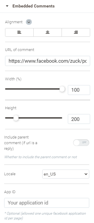
For Advanced configuration options see Configuring Sections.
More on embedding Facebook comments.
Disqus is a web service to discuss issues. With the help of the present widget these discussions can be imported into your page.
To enable Disqus comments, indicate your Disqus shortname.
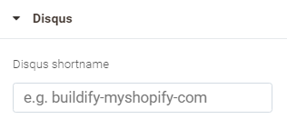
A shortname is the unique identifier assigned to a Disqus site. All the comments posted to a site are referenced with the shortname. The shortname tells Disqus to load only your site's comments, as well as the settings specified in your Disqus admin.
The shortname can be seen in the address bar of your browser as example.disqus.com/admin or in the forum settings.
For Advanced configuration options see Configuring Sections.
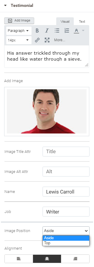
Add testimonials to the page with the help of the present widget. A testimonial box contains the text of the testimonial (aka feedback/review), and the signature of the author, that is an avatar, name and role.
Configuring Testimonial
| Content | Style | Advanced |
|---|---|---|
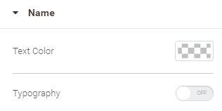
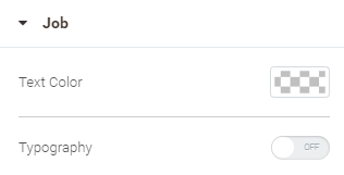
Suggest the content for the testimonial: text, avatar image, author's name and job. The text of the testimonial can be formatted with the help of the visual editor. Alternatively, you can provide the text with HTML tags in the text editor. Specify the Title Attr and Alt Attr values for best SEO practice, and set the position of the image relative to the author's name and role: Aside or Top. Finally, indicate the alignment of the testimonial within the column.
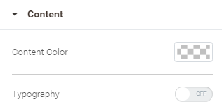
| Configure the color and font styles for the text of the testimonial, author's name and role separately. Setting Typography to On will unfold more configuration options for each block.
Specify the following parameters for the avatar image:
 | See Configuring Sections |
Tell customers more about yourself. Add the location of your store with the help of the Google Maps service.
The following configuration options are available to set up the widget:
- Address - the address to show on the map
- Zoom level - the level of zoom for the map
- Height - the height of the map
- Prevent Scroll - set to Yes to prevent the CTRL+scroll to zoom the map
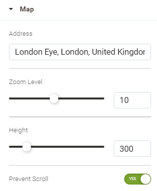
For Advanced configuration options see Configuring Sections.
The Google Translate widget allows customers to translate your page into their native languages.
The following configuration options are available to set up the widget:
- Alignment - set the position of the Google Translate inscription and language selector within the column
- Display mode - choose how the widget is to be displayed on the page: Tabbed or Inline
- Layout - set up how the parts of the widget are to be combined
- Translation banner - set to Show to automatically display the Translation banner to users, who speak languages different to that of your page. The banner is displayed at the top of the page and follows the scroll.
- Multilingual page - set to Yes if you have multilingual content on the page. It will help Google Translate to detect multilingual content faster.
- Track translation traffic - set to Yes if you have a Google Analytics account, you can connect it to your page. Enter your Google Analytics ID here. Google will analyze traffic automatically and show the results in your Google Analytics account.
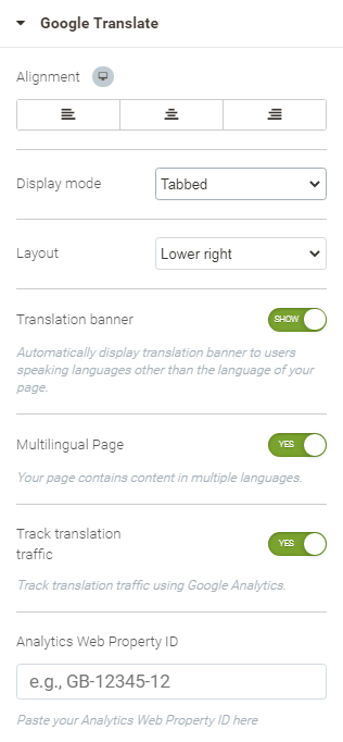
For Advanced configuration options see Configuring Sections.
Employ the Google Hangout widget to add the Hangout button to the page. Clicking on the button visitors launch a Google Hangout directly from your site.
The following configuration options are available to set up the widget:
- Alignment - the alignment of the button within the column
- Button width - the width of the Google Hangout button
- Account - the email to auto-invite
- Locale - specify the language of Google Hangout to open
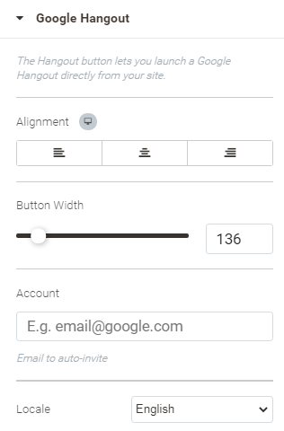
For Advanced configuration options see Configuring Sections.
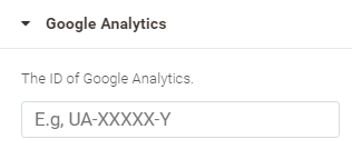
Google Analytics provides metrics, trend graphs, and time stats from Google Analytics Service.
To enable Google Analytics on the page enter the ID of your Google Analytics account.
You will need a Google account to enable Google Analytics. The widget does not use your Gmail account for anything other than signing in and out of Google Analytics.
Do not use multiple Google Analytics widgets of the same kind on one page.
For Advanced configuration options see Configuring Sections.
Pricing
Add a detailed table of offer to the page. The table lists the price and detailed features of the offer. To prompt action, the table has a button and text of motivation. Visual elements of design, like sales ribbon, headers, etc facilitate further motivation to act.
Configuring Price Table
| Content | Style | Advanced |
|---|---|---|
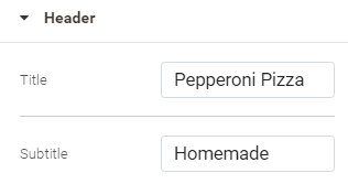
Header block Specify the name for your offer Title and Subtitle - the title and subtitle of the offer
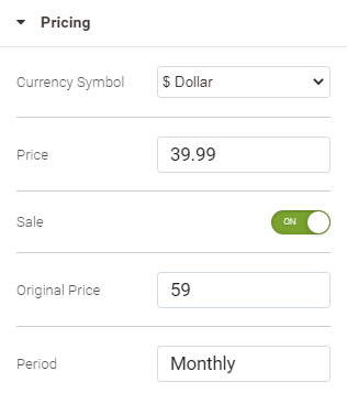
Pricing block Specify the price of the offer. If it is sale, you can indicate the old price too.
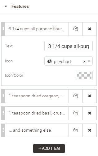
Features block Add features to your offer, explain what is included in it. Click on the Add Item button to add a feature. Features are collected into a list. You can shuffle the list, add, copy, delete and edit features. Clicking on a feature will unfold you the following options:
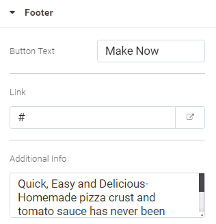
Footer block Provide a call and motivation for action.
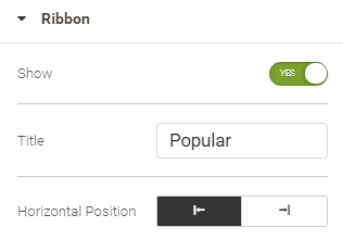
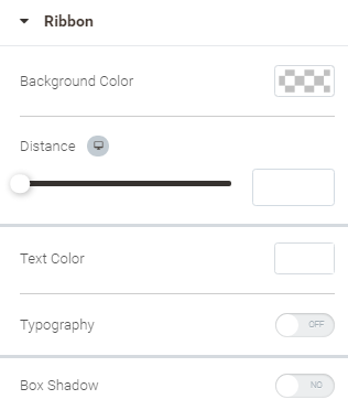
Ribbon block Decide if you want to show a ribbon at the corner of the Header of the table. Set Show to Yes to do so. Specify the title and position of the ribbon.
| Header block
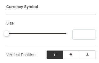
Pricing block Since price is of a text attribute too, same configuration options as those for Header are present here. At the same time, you can further specify the position of the currency symbol, original price and payment period, as well as to tweak the sizes of these elements.
Features block Since features are of a text attribute too, same configuration options as those for Header are present here. At the same time, you can further specify the alignment and width of the features block. Furthermore, this is where you can style the divider - the line that divides the features. To enable the dividing line, set Divider to Yes. The following options will get available:
Footer block Since footer has elements of a text attribute, same configuration options as those for Header are present here. At the same time, you can further specify the margins for the text of motivation. Furthermore, this is where you can style the button. Do that for the two states: when the mouse cursor is hovered over the button and when not.
Ribbon block Since ribbon has elements of a text attribute, same configuration options as those for Header are present here. At the same time, you can further specify the distance of the ribbon from the corner of the Header block and if the ribbon is to have any shadow.
| See Configuring Sections |
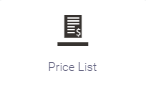
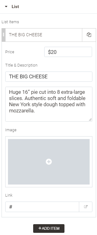
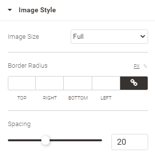
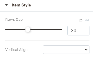
Add a price list/menu to the page. The price list / menu features the items you sell, their prices and descriptions. You can furthermore upload images to visually support the items you sell.
Configuring Price List
| Content | Style | Advanced |
|---|---|---|
Find here the list of items to feature on the price list. To add an item, click on the Add Item button. You can shuffle the list, add,copy, delete and edit items. To edit an item, click on it. The following configuration options will get available:
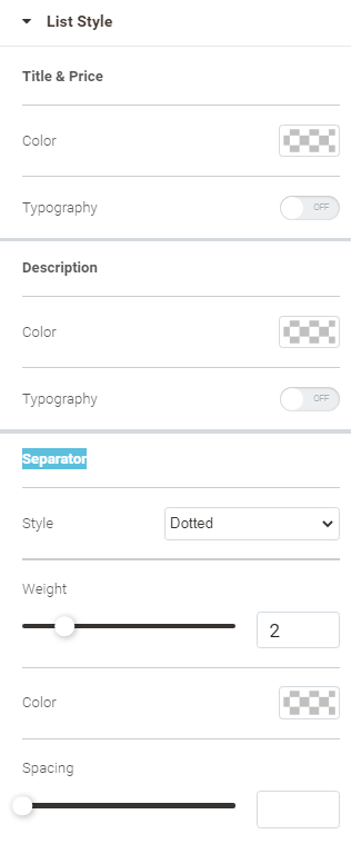
| List Style Block
Image Style block
Item Style
| See Configuring Sections |

Employing Embedded comments is a simple way to retrieve public posts into the content of your web site or web page. Only public posts from Facebook Pages and profiles can be embedded.
The following configuration options are available to set up the widget:
- Alignment - the alignment of the widget within the column
- URL of post - the URL of the post to embed
- Width - the width of the embedded post box
- Height - the height of the embedded post box
- Include full post - set to On to fetch the image of the post alongside the text
- Locale - the code of the country and language you want to see in the post box
- App Id - your Facebook API, if any.
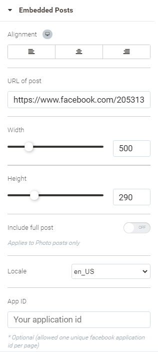
For Advanced configuration options see Configuring Sections.
Employ Facebook Video Player to add Facebook videos and Facebook live videos to your website. You can use any public video post made by either a Page or a person as a video or live video source.
The following configuration options are available to set up the widget:
- Alignment - the alignment of the widget within the column
- URL of video- the URL of the video to embed
- Width - the width of the embedded video box
- Height - the height of the embedded video box
- Include full post - set to On to fetch the text of the post alongside the video
- Locale - the code of the country and language you want to see in the video box
- App Id - your Facebook API, if any.
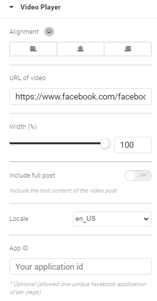
For Advanced configuration options see Configuring Sections.
Add the Facebook Like button to the page. A single click on the Like button will 'like' your content and share it onto Facebook.
You can also display a Share button next to the Like button to allow people to select the people they are sharing your content with and to add a personal note to the message.
The following configuration options are available to set up the widget:
- Alignment - the alignment of the widget within the column
- URL to like - the URL of the resource that will be liked and shared by visitors on Facebook on clicking the button
- Action Type - the action to be performed on clicking on the button: Like or Recommend
- Layout style - the style of the layout of the button: Standard, Button, Button Count, Box Count (count shows the number of presses on the button)
- Button size - the size of the button
- Wrapper Width - the width of the wrapper enclosing the button
- Include Share Button - set to On to display the Facebook Share button next to Like
- Show Friends Faces - set to On to show profile photos when 2 or more friends like this
- Locale - the code of the country and language for Facebook to interpret your content correctly
- App Id - your Facebook API, if any.
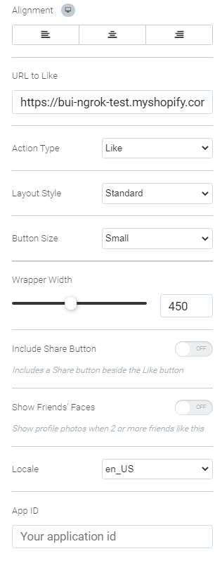
For Advanced configuration options see Configuring Sections.
The Page plugin lets you easily embed and promote any Facebook Page on your website. Visitors can browse the posts, like and share the Page without leaving your site.
The following configuration options are available to set up the widget:
- Alignment - the alignment of the widget within the column
- Facebook Page URL - the URL of the page to embed
- Tabs - the page tab to render (timeline, events, messages). Use a comma-separated list to add multiple tabs i.e. timeline, events.
- Width - the width of the embedded page box
- Height - the height of the embedded page box
- Use Small Header - set to On to use a smaller version of the page header
- Adapt to plugin container - set to On for the widget to try to fit inside the column
- Hide Cover Photo - set to On to hide the cover photo of the page from the embedded page box
- Show Friends' Faces - set to On to show profile photos when 2 or more friends like this
- Locale - the code of the country and language you want to see in the page box
- App Id - your Facebook API, if any.
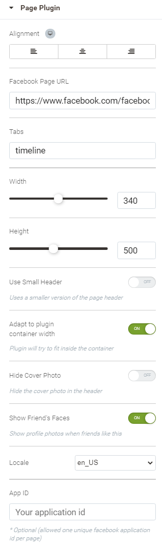
For Advanced configuration options see Configuring Sections.
More on Facebook Page plugin.
The Facebook Quote widget allows people to select text on your page and add it to their share, so they can tell a more expressive story. When text is selected, a popover is displayed prompting people to share the quotation.
You do not need to implement Facebook login or request any additional permissions through app review in order to use this plugin.
To employ the widget, indicate the locale for the quote and add the app ID. The latter is optional (one unique Facebook application id is allowed per page).
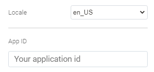
For Advanced configuration options see Configuring Sections.
More on Facebook Quote plugin.
The Facebook Share button lets people add a personalized message to links before sharing your page on their timeline, in groups, or to their friends via a Facebook Message. Clicking on the button will call the Facebook Share popup.
The following configuration options are available to set up the widget:
- Alignment - the alignment of the widget within the column
- URL to share - the URL of the resource that will be shared by visitors on Facebook on clicking on the button
- Layout style - the style of the layout of the button: Standard, Button, Button Count, Box Count (count shows the number of presses on the button)
- Button size - the size of the button
- Wrapper Width - the width of the wrapper enclosing the button
- Mobile Iframe - set to On to show the share dialog in an iframe on mobile
- Locale - the code of the country and language for Facebook to show you the Share pop in appropriate language
- App Id - your Facebook API, if any.
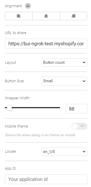
For Advanced configuration options see Configuring Sections.
More on Facebook Share Button.
The Facebook Save Button widget inserts the Facebook Save button into the page. The button lets people save items or services to a private list on Facebook, share it with friends, and receive relevant notifications. For example, a person can save an item of clothing, trip, or link that they're thinking about and go back to that list for future consumption, or get notified when that item or trip has a promotional deal.
The following configuration options are available to set up the widget:
- Alignment - the alignment of the widget within the column
- Link of a website or product to save - the URL of the resource that will be saved by visitors to their Facebook accounts on clicking on the button
- Button size - the size of the button
- Wrapper Width - the width of the wrapper enclosing the button
- Locale - the code of the country and language for Facebook to interpret your content appropriately
- App Id - your Facebook API, if any.
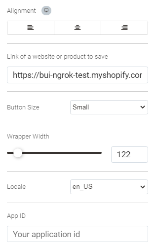
For Advanced configuration options see Configuring Sections.
More on Facebook Save Button.
Embed Twitter posts with description, Likes and comments.
The following configuration options are available to set up the widget:
- Alignment - the alignment of the widget within the column
- URL of post - the URL of the post to embed
- Max Width - the width of the post box
- Hide Media - set to Hide to expand the links in the Tweet to photos, videos and previews
- Hide Thread - when set to Hide, a collapsed version of the previous Tweet in a conversation thread will not be displayed when the given Tweet is the reply to another Tweet
- Widget Type - the type of the widget: video, tweet
- Theme - the theme of the post box: light, dark
- Lang - the language of the post box controls
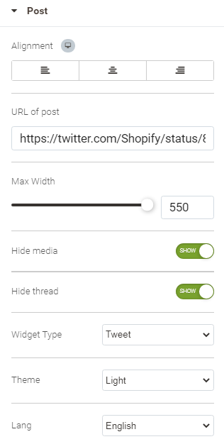
For Advanced configuration options see Configuring Sections.
Add Twitter Timeline onto your page. Timeline is a list or aggregated streams of posts.
The following configuration options are available to set up the widget:
- Alignment - the alignment of the widget within the column
- URL of profile - the URL of the profile to contain the timeline to embed
- Width - the width of the timeline box
- Max Height - the height of the timeline box
- Tweet Limit - the number of tweets to show in the embedded timeline
- Hide Header - set to Hide to hide the timeline header.
- Hide Footer - set to Hide to hide the timeline footer and Tweet composer link, if included in the type of the timeline widget.
- Hide Border - set to Hide to remove all borders within the widget including those surrounding the widget area and separating Tweets.
- Hide Scrollbar - set to Hide to crop and hide the main timeline scrollbar, if visible. Mind, that hiding standard user interface components can affect the accessibility of your website.
- Transparent Background - set to Yes to hide the background of the widget
- Theme - the theme of the post box: light, dark
- Lang - the language of the post box controls
When timeline header is hidden, add some custom Twitter attribution, a link to the source timeline, for example, to comply with Twitter display requirements.
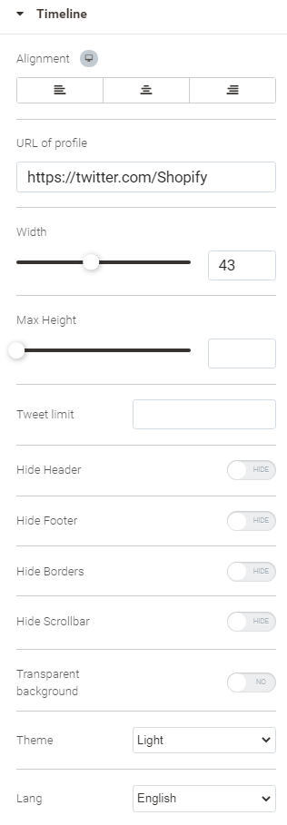
For Advanced configuration options see Configuring Sections.
Share information about the most interesting moments from Twitter.
The following configuration options are available to set up the widget:
- Alignment - the alignment of the widget within the column
- URL of post - the URL of the moment
- Width - the width of the post box
- Limit - the number of tweets to show in the embedded moment
- Hide Footer - set to Hide to hide the timeline footer and Tweet composer link
- Lang - the language of the post box controls
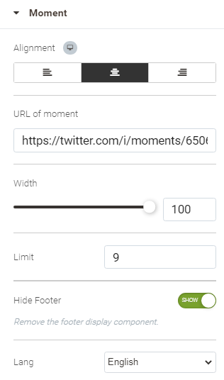
For Advanced configuration options see Configuring Sections.
Add the Twitter Follow button to the page to help customers follow your profile on Twitter.
The following configuration options are available to set up the widget:
- Alignment - the alignment of the button within the column
- URL of profile - the URL of the profile to follow
- Size - the size of the button: Standard, Large
- Hide Username- set to On to hide the username of the account
- Hide Count - set to On to hide counter of followers
- Lang - the language of the post box controls
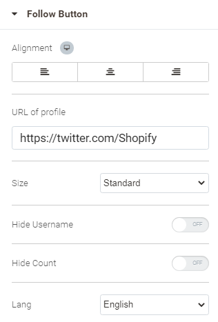
For Advanced configuration options see Configuring Sections.
Add the Twitter Share button to the page to help customers share your content on Twitter.
The following configuration options are available to set up the widget:
- Alignment - the alignment of the button within the column
- Size - the size of the button: Standard, Large
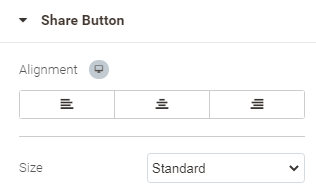
For Advanced configuration options see Configuring Sections.
Add the Twitter Message button to the page and enable customers to send you direct messages, fast and easily.
The following configuration options are available to set up the widget:
- Alignment - the alignment of the button within the column
- Size - the size of the button: Standard, Large
- Twitter user ID - the user ID of the Twitter user who will receive the messages.
To find your User ID, navigate to the Your Twitter data section in Settings, your User ID will be located right below the @username.
Make sure, your Twitter account settings are set to “Receive Direct Messages from Anyone” (Settings > Security and Privacy > Privacy).
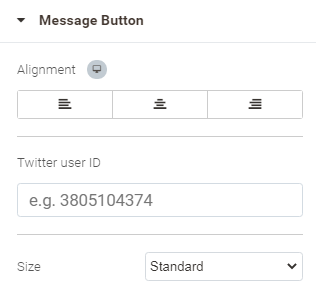
For Advanced configuration options see Configuring Sections.
Analytics
Add metrics, trend graphs, and time stats from the Yandex Metrica service to your page.
To employ the widget, enter your Yandex.Metrica counter number.
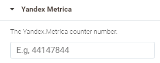
A Yandex Metrica counter number is a unique identifier of the data storage associated with the counter. It is assigned by the Metrica system automatically on creation of the counter, and can not be changed later.
To work with Yandex.Metrica, you will need a Yandex user account. You can start one here.
If you have advertising campaigns in Yandex.Direct, or your online store is a Yandex.Market partner, we recommend that you log in with the username registered for one of these services. This will allow you to quickly switch between the services.
Do not use multiple analytic widgets of the same kind on one page.
Modal Windows
Add a modal section to the page. A modal window is intended to display all sorts of information. A modal window is any type of window that is a child (secondary window) to a parent window and usurps the parent's control. The Modal Section widget associates a modal window with a pop-up that stays in front of the original window.
The widget allows displaying a modal window in the following situations:
- Timeout: will be displayed after the specified time.
- Window leave: will be displayed when the cursor leaves the window.
- Hover element: will be displayed when the cursor hovers over the element .
- Click element: will be displayed on clicking on the selected element.
Configuring Modal Section
| Layout | Style | Advanced |
|---|---|---|
You will see the structure for the modal window at the bottom of the Layout settings. This is where you may reset the structure. Do that by clicking on the Reset Structure icon and text. | Wrapper Background color - the color of the area around the modal window.
Modal Window Background - select the type of the background for the modal window: None, Classic, Gradient, Video. For Video, specify the link to the video file and upload/select the cover image. For other types of background refer to Configuring Columns.
The Background Overlay block is available when Modal Window Background Type is Classic or Gradient. The block has similar configuration options to that of Modal Window Background, but for the extra Opacity option. The Opacity option is available for the Classic and Gradient background overlay types. It is meant to specify the transparency of the background overlay.
Close Button block (located on the top right of the window)
Border block By default, no border is applied to the column. Border Radius is visible, though not applicable. Select the type of the border: None, Dotted, Solid, Dashed, Double. When anything but None is selected, you can specify the width, color and radius of the border. Clicking on the Chain icon for width or radius will link/unlink the values for the top, bottom, left and right dimensions. When unlinked, each dimension can be set individually. You can switch between fixed and floating (%) values for the border radius with the help of the PX and % selector above the parameter.
Shape Divider block By default, no dividers are applied. The Type is then set to None. Otherwise, you can employ a pre-arranged shape to visually separate the modal windows, if a few of them respond to the same trigger. The Top and Bottom tabs allow switching between the two dividers, top and bottom correspondingly, configuring each separately. The list of shapes can be accessed via the Type option. Depending on the chosen shape the list of configuration options can be as follows:
Two configuration options are available for the Typography block: Colors and Text Align. The former is meant for headings, text, links and link hover. The latter allows choice between left, center and right alignment of text within the modal window.
| See Configuring Sections |
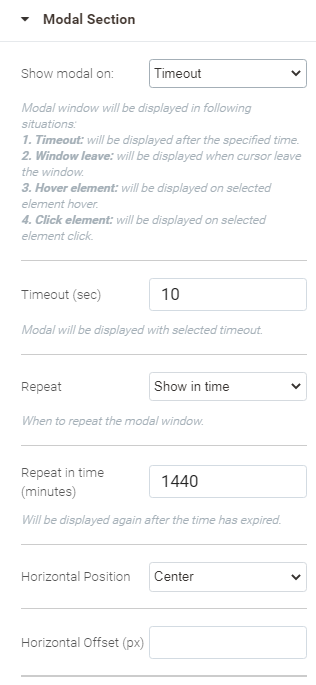
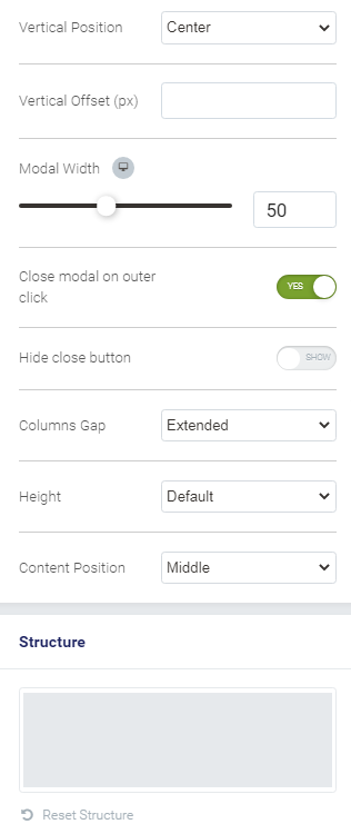
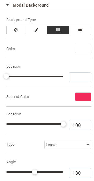
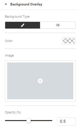
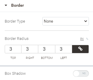
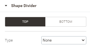
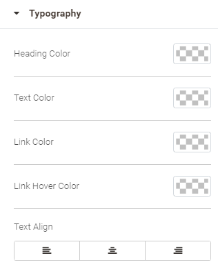
Uninstalling
Manual Removal
1. Disable the module by executing the following commands:
php bin/magento module:disable Aheadworks_Buildify
php bin/magento setup:upgrade
2. Remove the extension files from the following folder:
app/code/Aheadworks/Buildify
Automatic Removal (via Composer)
1. Disable the module by executing the following commands:
php bin/magento module:uninstall Aheadworks_Buildify
Need Customization?
.png?version=1&modificationDate=1585116256098&cacheVersion=1&api=v2)
You can always find the latest version of the software, full documentation, demos, screenshots, and reviews on http://aheadworks.com
License agreement: https://aheadworks.com/end-user-license-agreement
Contact Us: https://aheadworks.com/contact
Copyright © 2021 Aheadworks Co. http://www.aheadworks.com